 |
| 12 vs. 9 |
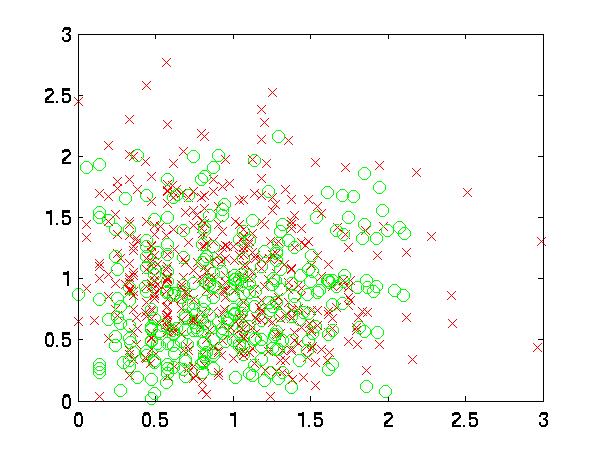
For example, in
the following graph, near the top, there is a patch of red x's,
and on the right, there are several patches of green o's. Also,
in the bottom left are some green o's.
|
| 12 vs. 9 |
As usual, I swept through the features independently to find which
ones might contribute the most. I was pleased to note that many of
them classified better than the Priors. I had not
had such luck so far on this project. In fact, the top
feature with kNN was nearly as good as the carefully-sifted
combination using Bayes. It was also intriguing to see the
top 5 features were 4, 12, 15, 16 and 17.
| Classification Rate | Feature # |
| 57.4468 | 19 |
| 57.4468 | 22 |
| 57.4468 | 24 |
| 59.5745 | 1 |
| 59.5745 | 2 |
| 59.5745 | 14 |
| 59.5745 | 21 |
| 59.5745 | 23 |
| 61.7021 | 3 |
| 61.7021 | 9 |
| 61.7021 | 11 |
| 61.7021 | 13 |
| 63.8298 | 5 |
| 63.8298 | 7 |
| 63.8298 | 10 |
| 63.8298 | 18 |
| 63.8298 | 20 |
| 65.9574 | 6 |
| 65.9574 | 8 |
| 65.9574 | 17 |
| 68.0851 | 4 |
| 68.0851 | 12 |
| 68.0851 | 15 |
| 70.2128 | 16 |
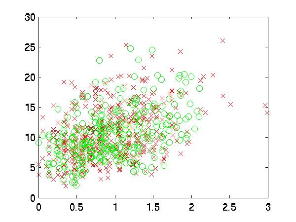
In this graph, you can see the best two features plotted
against each other. You will probably see lots of good local
regions. Since these graphs represent my personal preferences,
when I look at this I sometimes think, "This is
what my brain looks like."
 |
| 12 vs. 15 |
Ironically enough, that is when I realized that the axes were off. If one were to examine two points that were, for example, distance 5 away from each other in the horizontal direction, that would be very far, but in the vertical direction, it is not. Therefore, I decided to pre-process the features for kNN classification. I normalized them by dividing by the square root of their variance and subtracting their means. This makes it easier to connect the scaled graph with the results.
The rightmost column in the table below indicates that the
classification rate was a little higher using this improved distance
metric. Also interesting to note that the optimal k value for
that result is k=1. The optimal k was much larger when the axes
were uncorrected. All of these results are against the validation data.
| Feat. # | rand | init fwd | int bwd | rand, norm. |
| 1 | 0 | 1 | 1 | 0 |
| 2 | 0 | 1 | 0 | 0 |
| 3 | 0 | 1 | 1 | 0 |
| 4 | 1 | 1 | 1 | 1 |
| 5 | 0 | 0 | 1 | 0 |
| 6 | 0 | 0 | 0 | 1 |
| 7 | 0 | 1 | 1 | 0 |
| 8 | 0 | 0 | 0 | 1 |
| 9 | 0 | 0 | 1 | 0 |
| 10 | 0 | 0 | 1 | 1 |
| 11 | 0 | 0 | 0 | 1 |
| 12 | 0 | 1 | 1 | 1 |
| 13 | 0 | 0 | 0 | 1 |
| 14 | 0 | 0 | 1 | 0 |
| 15 | 1 | 1 | 1 | 1 |
| 16 | 1 | 1 | 1 | 0 |
| 17 | 0 | 0 | 1 | 0 |
| 18 | 0 | 0 | 1 | 0 |
| 19 | 0 | 0 | 0 | 0 |
| 20 | 0 | 0 | 0 | 1 |
| 21 | 0 | 0 | 0 | 0 |
| 22 | 0 | 0 | 0 | 1 |
| 23 | 0 | 0 | 1 | 0 |
| 24 | 0 | 0 | 0 | 0 |
| Rate | 76.60% | 76.60% | 72.34% | 77.083% |
This may have been improved with a better window function.