Assignment 6
Final presentation for the second module in PDF
Assignment 5
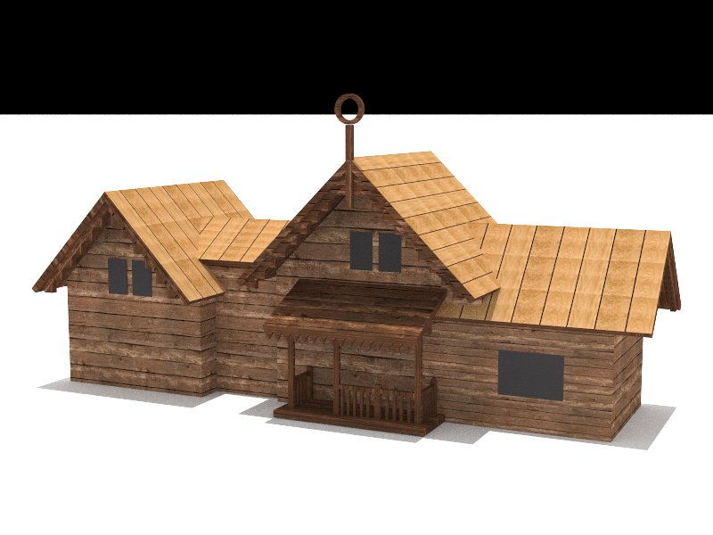
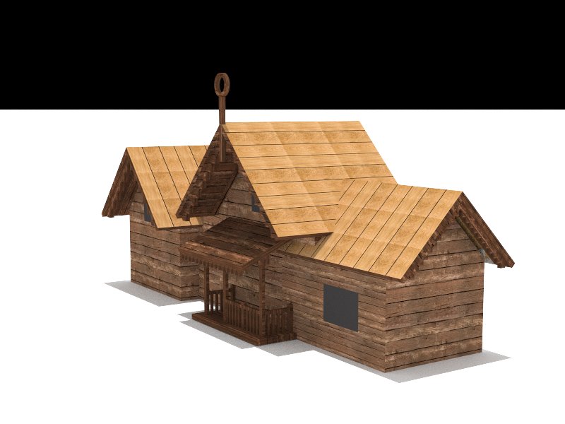
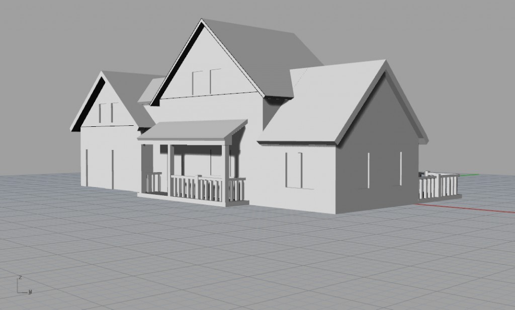
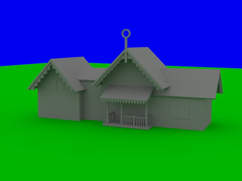
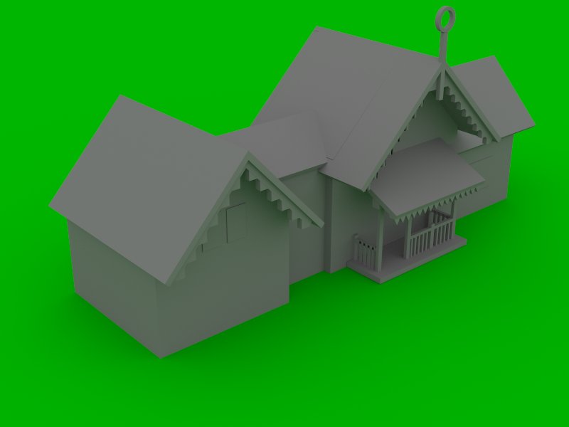
Re-render the house (same perspective as last week) but this time apply color and materials. Justify your decisions according to last week's discussion about colors.
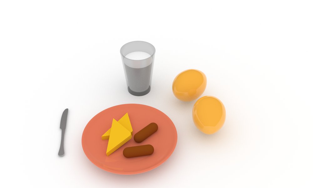
Design your breakfast scene, apply materials and render with VRay using 600x1000 frame size. Don't change the default lighting and/or camera setting (this will wait for next week!). Justify your rendering using our readings (2D composition, color, etc).
Assignment 4
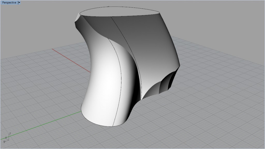
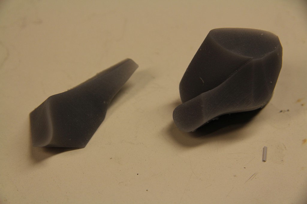
- Print your two solids using the Formlab machine, bring the prints to class next week.
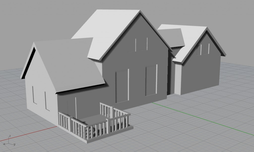
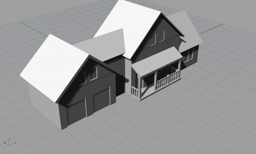
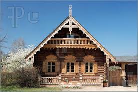
- Switch your design files of the house (.3dm) with your pair, and briefly share your styling intentions. For next week, style the work of your friend based on her/his instructions. Share initial sketches / ideas between you during the week. Render the final results with VRay, using default setting (including a ground plate). Upload only 2 views to the website.
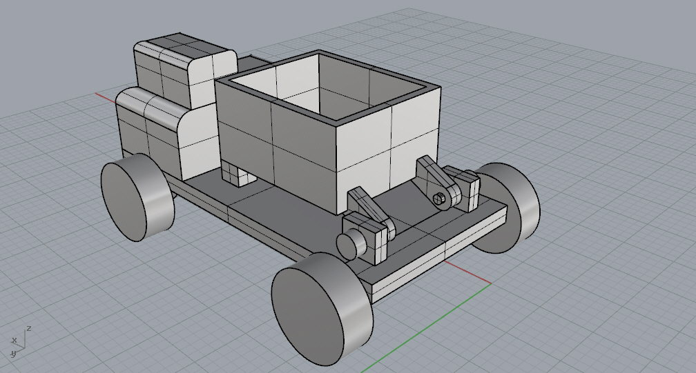
- You have $50 budget for Shapeways Nylon12 order. Based on this link, design a moving-parts object with 3 directions of motion, using one of the techniques that we discussed in class. If you choose to design a flexible manifold or a string, please include more than one “atom” design, and include at least 20 atoms. Use your account only for evaluating cost and file quality only (don't order yourself). Share your STL file with me by Friday.
Assignment 3
Part 2
Part 3
Part 4
Shapeways:
Object 1
16 cm3 volume
White (Strong and Flexible): $23.89
Object 2:
7.1 cm3
White (Strong and Flexible) $11.51
Solid Concepts
Object 1
SLS Prototype, Nylon 12 GF, ColorTek Black: $73.00
Object 2
SLS Prototype, Nylon 12 GF, ColorTek Black, $69.00
i.Materialize
Object 1
Polyamide, Natural finish: $16.90
Object 2
Polyamide, Natural finish: $16.90
Part 5
Assignment 1
Part 1
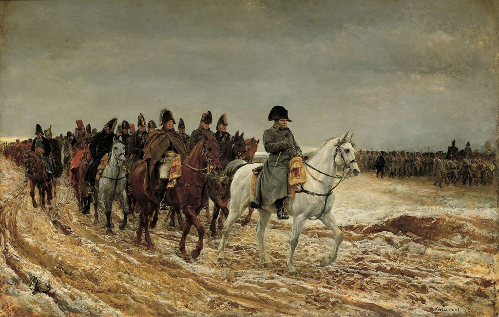
This is a painting titled "1814. Campagne de France" by Ernest Meissonier. Painting was completed in 1864.
It is clear that the artist is using diagonal armature. Napoleon in the front and his entourage is forming a diagonal line across the picture. Also, the road underneath is forming a diagonal across the image. The diagonal line is broken by the line of soldiers in the back. This is used, as reading suggests, to prevent the diagonal from gaining momentum.
The image also has other armature element of radiating lines. The lines radiates from the back towards the viewer, and finish with the Napoleon at the head of the column. This as probably used to emphasize Napoleon's importance. The gaze of the viewer unavoidably slides to Napoleon.
The depth of the image is emphasized by the column of horses. The horses appear to be overlapping to create depth, and emphasize the large size of the column.
The artist also carefully chosen the masses. Mainly there is four masses: the sky, road, napoleon, and his entourage. Once again, the masses are structured to give distinction to Napoleon.
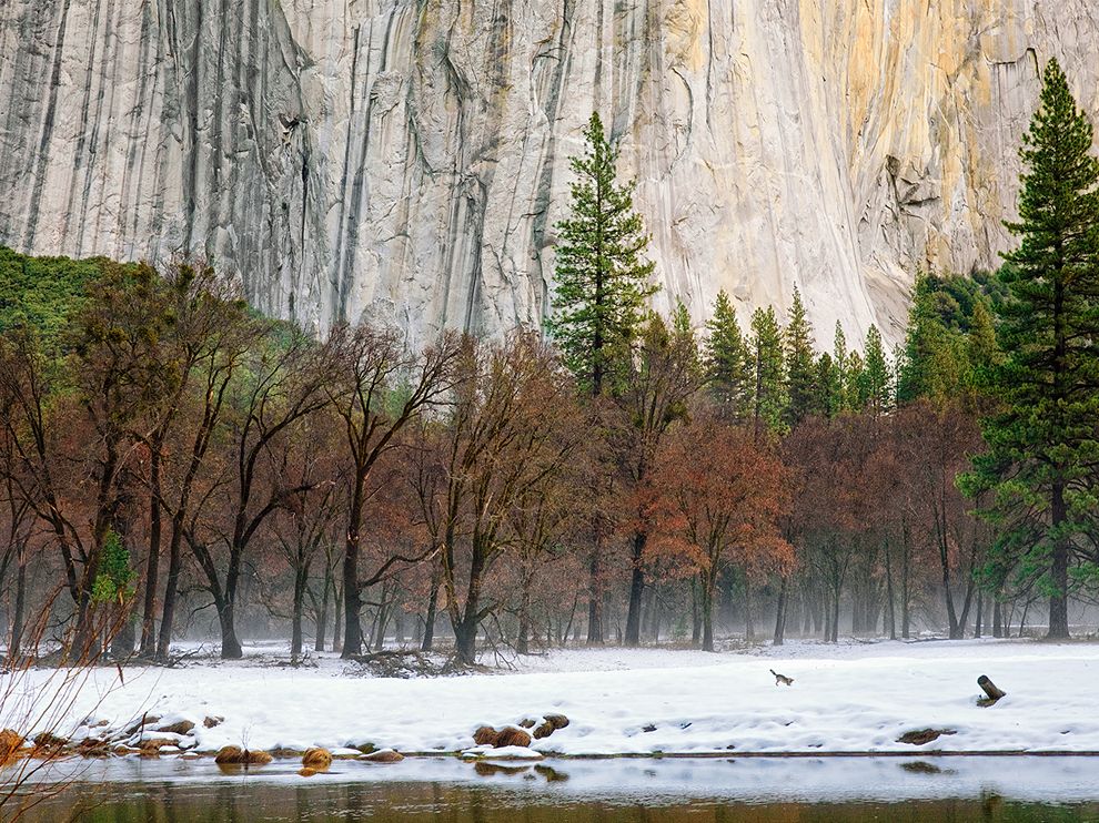
This is a National Geographic Photo of the Day. Title is "Winter Morning, Yosemite". Photograph was done by Tony Williams in 2012
The armature in this image is strongly vertical and horizontal. To balance the domination of the vertical texture, the ground, tops of trees, and the lake provides horizontal armature.
The image has three distinct masses with different color and texture. The mountain in the back, the trees in the middle and the snow in the front. The dominating colors of the masses has patterns, light, dark, light, dark. Those masses makes the image more appealing to the yes, because they create strong contrasts, and symmetry.
Part 2
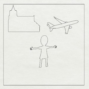
Portrait armature. The human figure in the center is placed to draw attention.
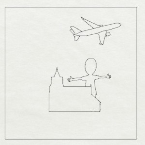
Vertical armature with depth. The overlap is used to place the figure behind the church. Also, Because of the vertical arrangement airplane appears to be in the air.
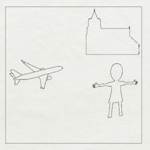
Fulcrum armature. The uneven distribution of objects was used to create balance
Part 3
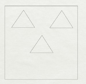
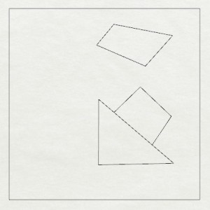
Repetition of the same triangular forms and symmetric design is used to bring a sense of harmony
Random shapes are used to create anomaly. It is used to attract attention
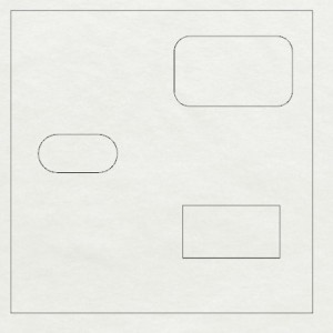
The curvature of the rectangular shapes is modified. This way the objects appear to be fundamentally similar, yet slightly different on the surface
Part 4
Assignment 2
Part 3
Part 4
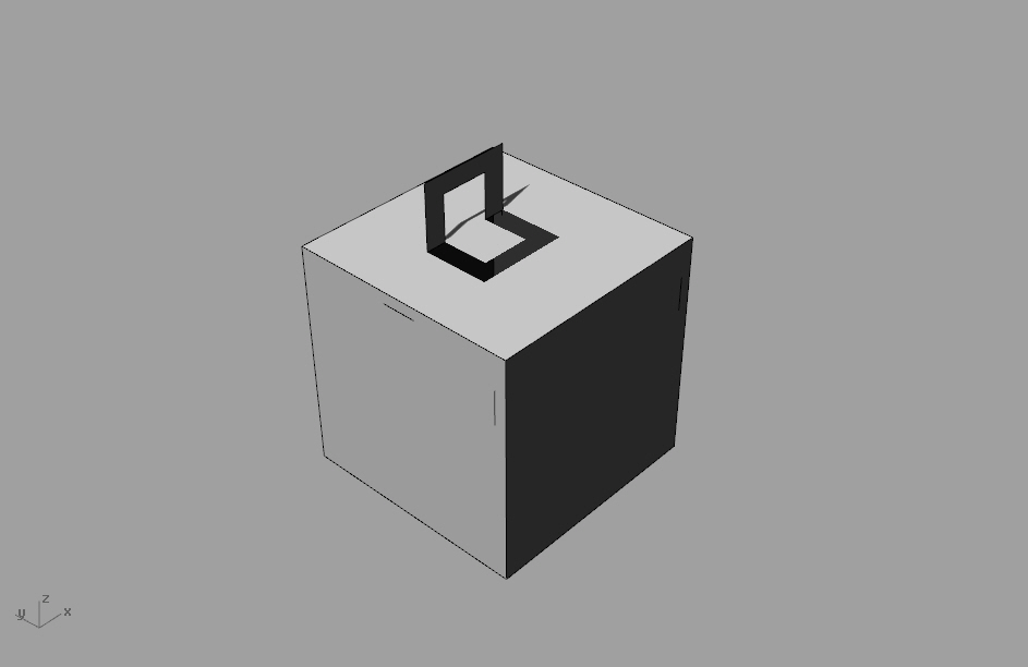
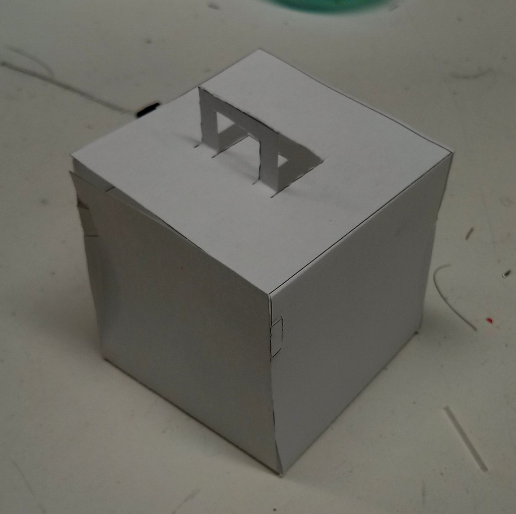
My main goal in styling was to make the box as simple as possible, and yet to appear functional. So, I tried to hide the connections between the walls as much as possible. I used only a 2 mm wide strip and a hole to connect the walls and the lid together. I also avoided putting anything on the walls. The only styling element was the handle on the top. The handle serves to show where the lid is, and to remind us about the function of the box ( a container)
Initially I used a larger rectangular press-fit elements. They didn't work well because of construction issues. The spacing between the elements was too small, therefore the paper ripped apart. Also, the connectors were unnecessarily large, this was interfering with the simple style. I realized that the box does not need large connectors to stay together.
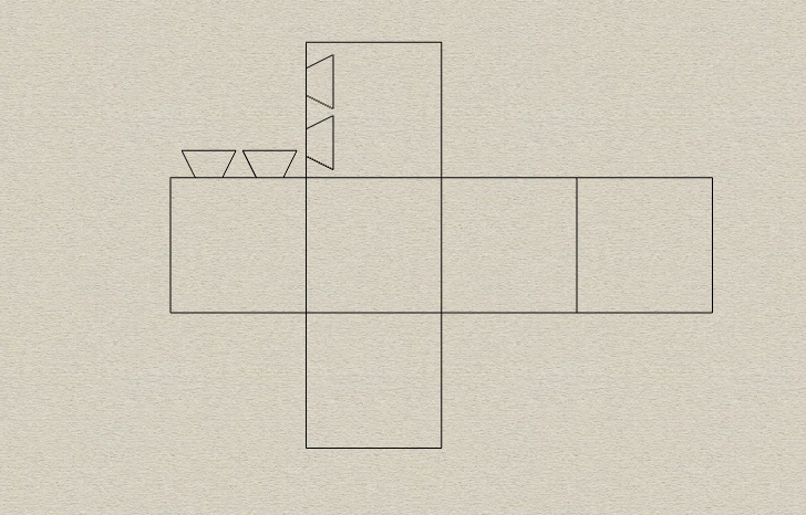
Initial 2D box design. I only press-fitted one wall for testing
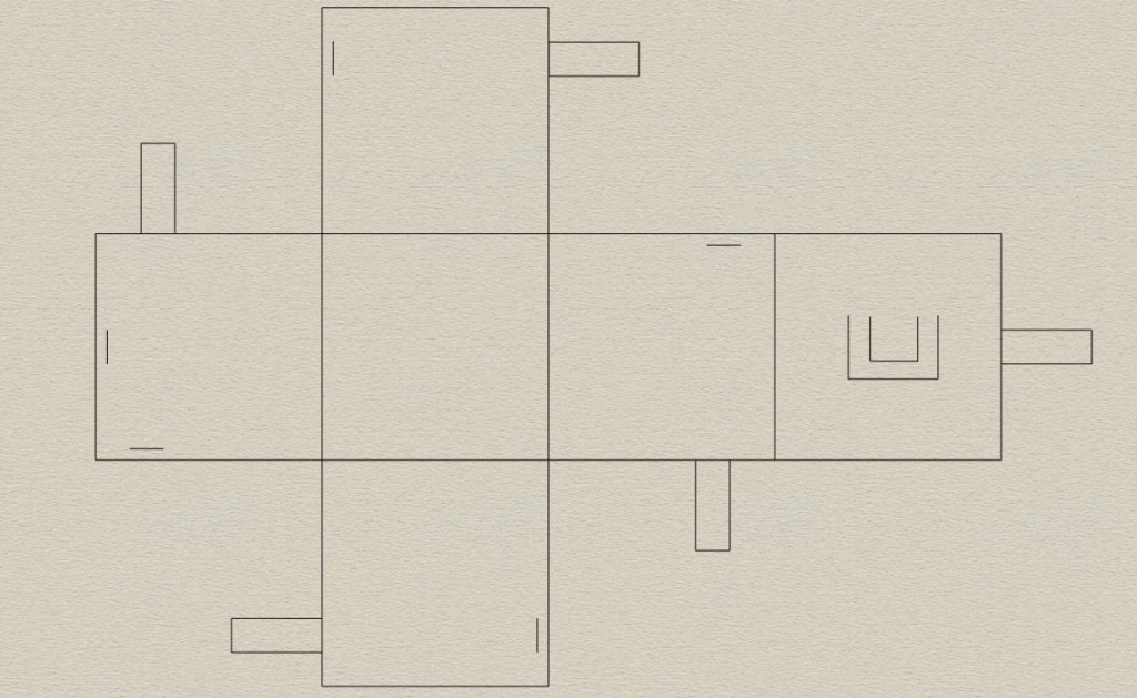
Final 2D box design. I changed the press-fitting elements. I made them smaller and more invisible.
3D rendered box.
Picture of the constructed box.

