My name is Ryan Borker. I'm a Sloan 2014 MBA from Texas, planning to do a start-up related to social feedback and trust. I wasn't even 100% sure I knew what CAD was before this semester, and had never 3D printed anything. From my drawings you'll see my visual capabilities remain those of a 5 year old child. If you take one thing away from this page, it's that if I can do this, anybody can learn to. Go download a copy of Rhino, watch some tutorials, and you'll be on your way.
Final Project:
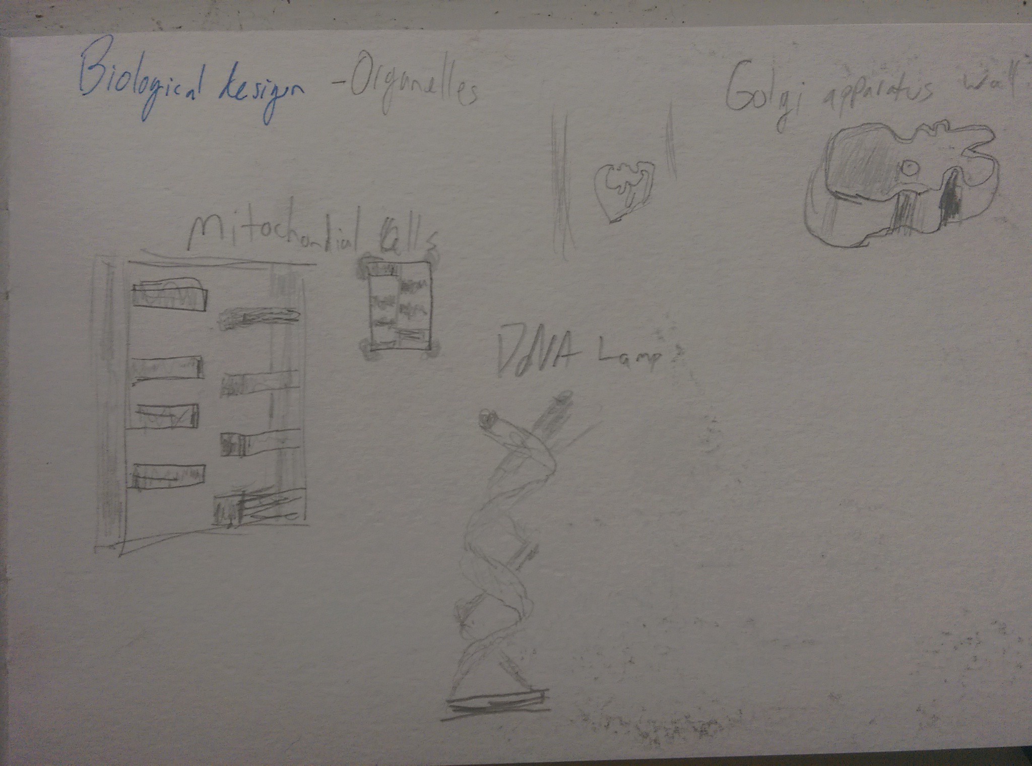
Saying I've never really designed before is a bit of a false claim. Going through a couple of journals, I found a page that had 'biological design' with housewares inspired from biology. I am not a great drawer, as you can see. However, as I thought about my final project I decided I might be able to leverage a similar concept.
I had, as in the project below, been interested in fractal patterns and experimenting (read: frantically trying to learn) with grasshopper and rhinoscript. I wasn't particularly gifted at either of them by the end of 2-3 weeks, but had found a couple of base scripts that I could modify and edit to do what I wanted. I found a particular pattern that I loved and figured would be great for a table. The table, was inspired by this one:
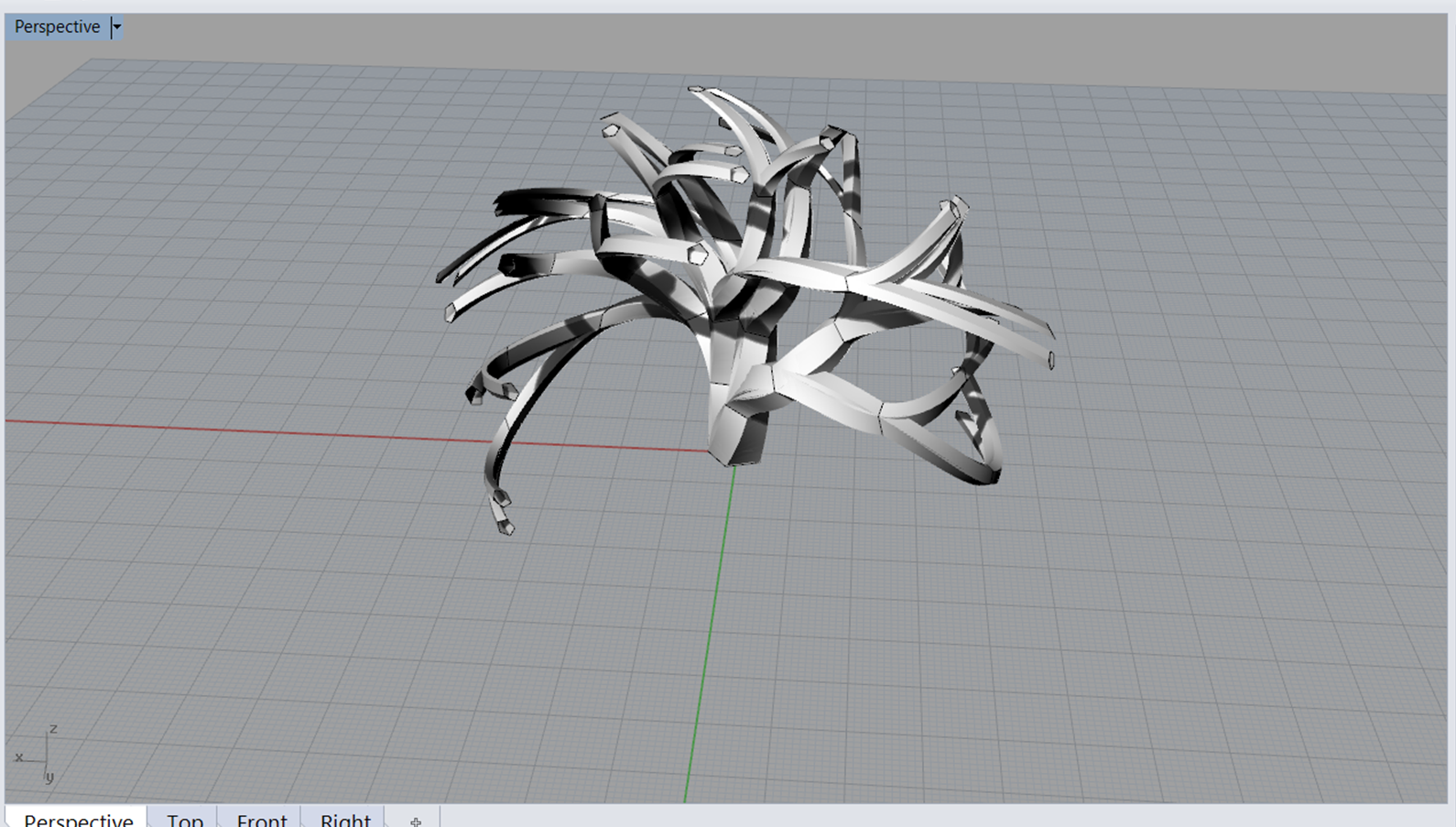
I took to learning and painfully debugging Rhinoscript. This is a place where you can stuck. But I finally succeeded in getting in the ballpark of a shape that I wanted:
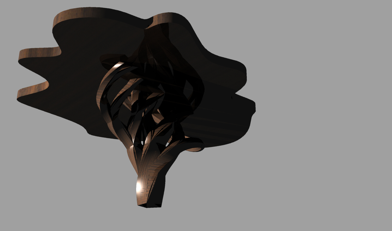
The pentagons gave it at a controlled design, with a strong natural and human element in my opinion. From here, finding the table was not too hard. I found a top shape of flowing curves that was practical enough for use, but interesting enough to catch the attention. I first tried renders in dark, reflective wood:
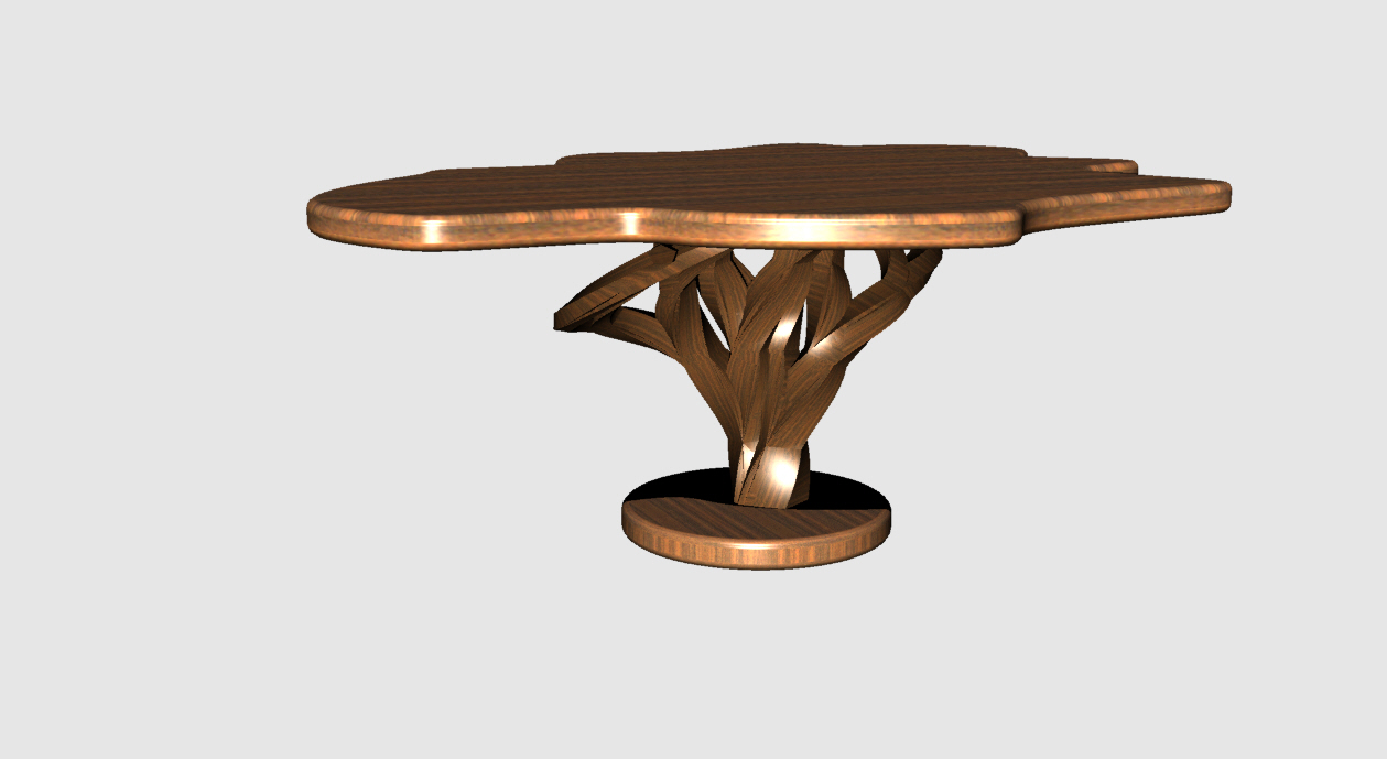
As you can see, it didn't look terrible, but I needed a base to make the table usable as a final design. I added a simple round base in contrast with the other complexity, and tried a lighter wood. I didn't have V-Ray working for these or any of the other renders, so I imagine a better renderer would make this look more real. Here is the final result:
If anyone wants to produce this for me, please let me know!
Hybrid Project:
I've always been an audiophile, and have a habit of indulging in the best headphones that I can afford. I recently purchased a pair of Audio Technica AD1000s in Japan.

Audio Technica AD1000s
The combination of the biological and mechanical design of headphones encouraged me to explore further with a couple of concepts that I had in my head.
1) Headphones are a weird mix of keeping the world out and harmonizing with the world. Anyone who has played the right song or 'soundtrack for your life' at the right moment will understand this feeling--it simultaneously disconnects and connects you.
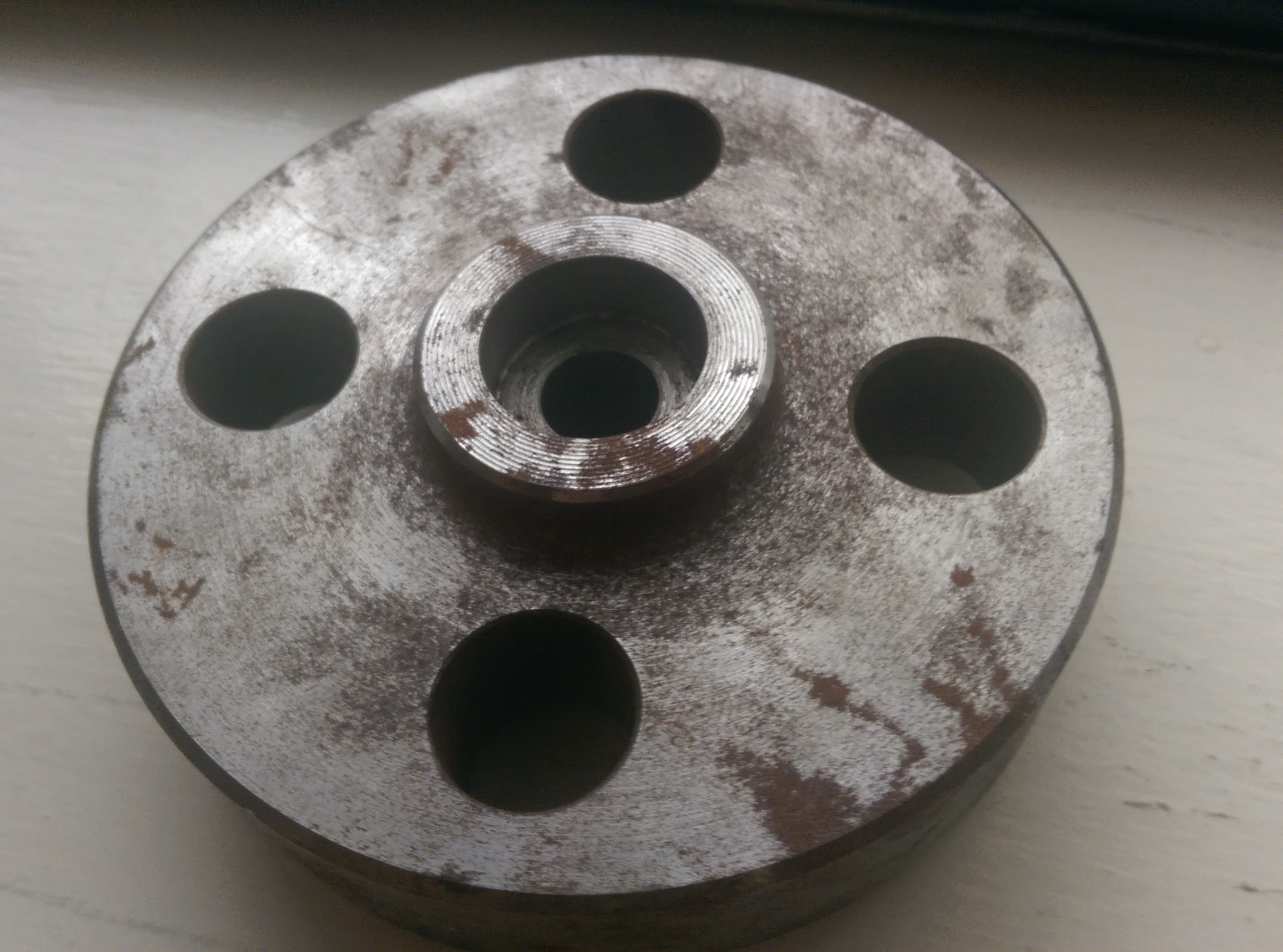
2) Industrial design has clean objects like flanges (pictured, below) that to me have the right simplicity for headphones.
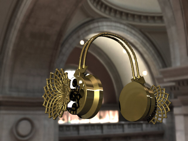
From these I wanted a simple design that projected the natural 'outward'. I decided that while impractical, the best expression of this was a natural design that projected outward from the headphones. I decided to borrow some code for creating phyllotactic spirals--a fancy way of saying how many flowers and leaves are arranged on plants. I piped these together into an arrangement that I found aesthetically appealing. Below is the finished result:
Gold was a color that I chose because of the fantastical nature of these headphones (I doubt you'll see these in nature).
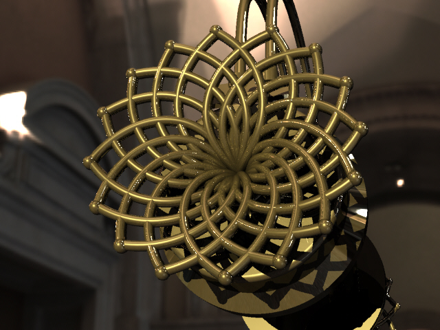
A close up of the relative aesthetic. These flairs would certainly make storage hard, but would certainly draw attention.
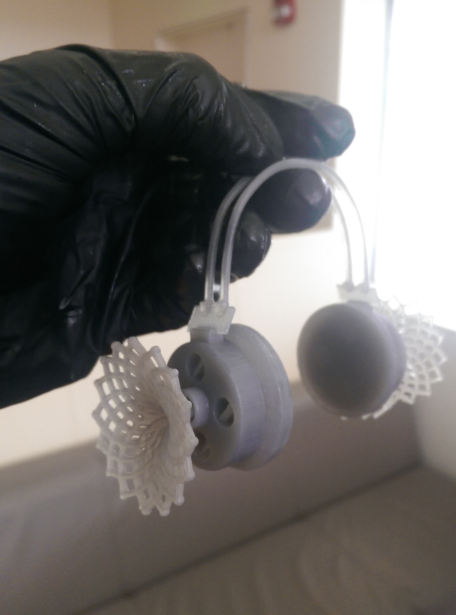
Since this was the first real 'object' I had designed and conceived of on my own--I wanted to print it and see how it would turn out. I used the Form 1 to print, and was impressed with the results, even on a smaller scale:
Breakfast Project:
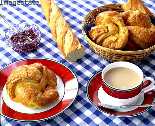
I lived in France for a year, and loved the French style breakfast. It was simple and filling: baguettes, jams, and cheese. A typical breakfast might look like this (if you were fortunate enough to live outside on a terrace:
I decided to attempt to reproduce this image to the best of my ability in Rhino. The colors of the table cloth with the red jam really make the scene appealing from both a visual and culinary aspect.
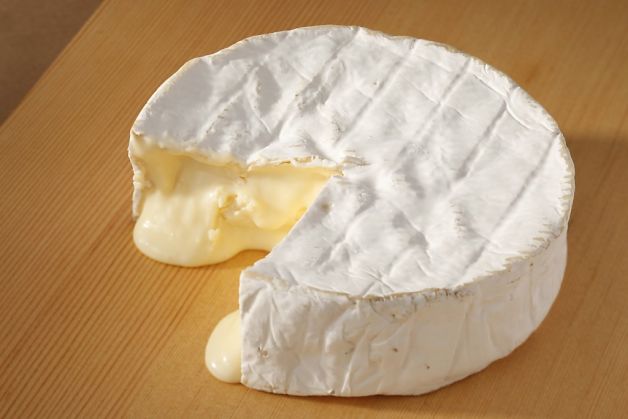
The hardest part of the project I felt would be getting the textures of the individual items just right:
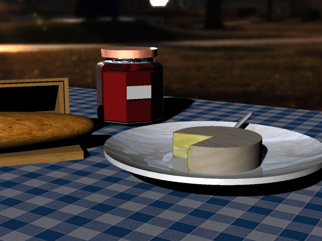
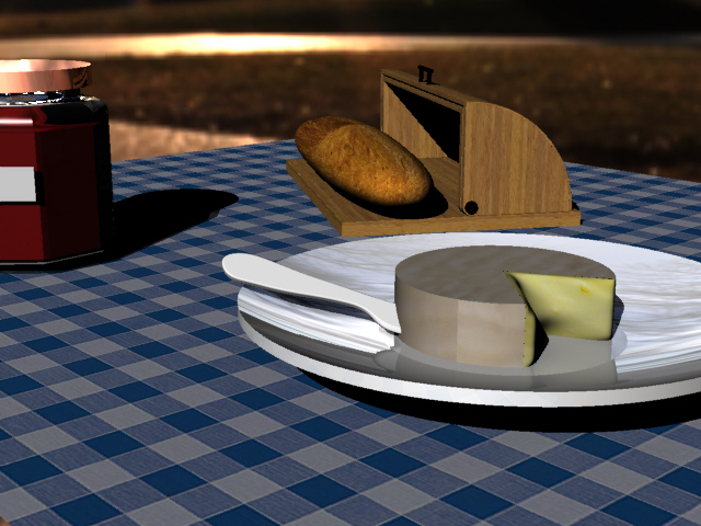
The Brie Cheese has a very complex set of textures that makes it both delicious and difficult to model. That said, I tried my best, stealing a bread basket from the internet but otherwise modeling on my own. Here are a couple shots of the final render:
The second image is probably the better of the two. I believe the lighting works well and serves to hide some of the modeling inadequacies. Higher quality images help the textures but not a significant improvement of what is here.
ASSIGNMENT 4:
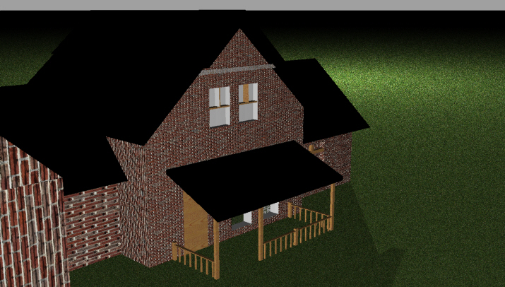
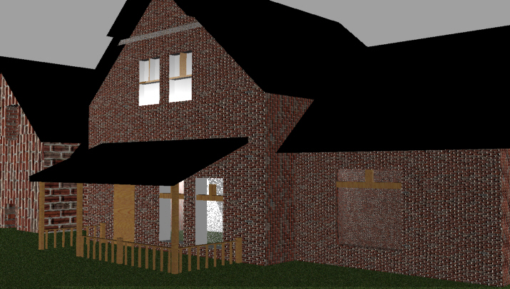
Having swapped a house with my talented partner, I spent most of my time on the rendering side trying to create windows that matched the picture. There are a number of issues with Windows in a modeled file: the first being that there is nothing actually inside the house, so transparency is something that isn't useful immediately. In order to obscure this fact, I attempted to take my shots at an angle. Additionally, I made the house out of brick since that was the most coherent form of styling I could find. Finally, I added 'panes' to the glass, which are very crude, but do make the windows look somewhat more realistic.
The trim detail at the top did not come out as planned either, and it creates a discontinuous look.
Finally, after rendering, I realized that the 'porch' had sunk under the ground plane. Especially in this shot you can see that lack of 'edges' around he windows make the entire house look unrealistic.
Moving Objects:
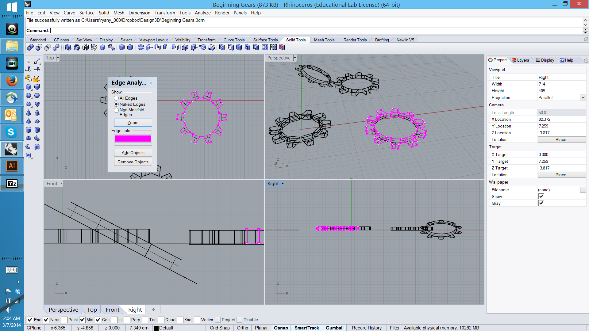
I have been unable to make a 3D object with moving parts. I have been stuck on 2 basic premises: how to make a small cylindrical shape out of a complex curve (to make a head or back scratcher). And how to get simple polar arrayed shapes to join into curves that could be printed. BooleanUnion and joins of any type I could think of did not work. I remain undeterred, but unwilling to lose more sleep after 4.5 hours working on this project. I do not have much to show, given that most of my time was spent figuring out how to do things I did not know how to do. The failed gears are below, but I did make the dimensions such that they would fit together and (hopefully) turn within the tolerances we set out before class.
ASSIGNMENT 3:
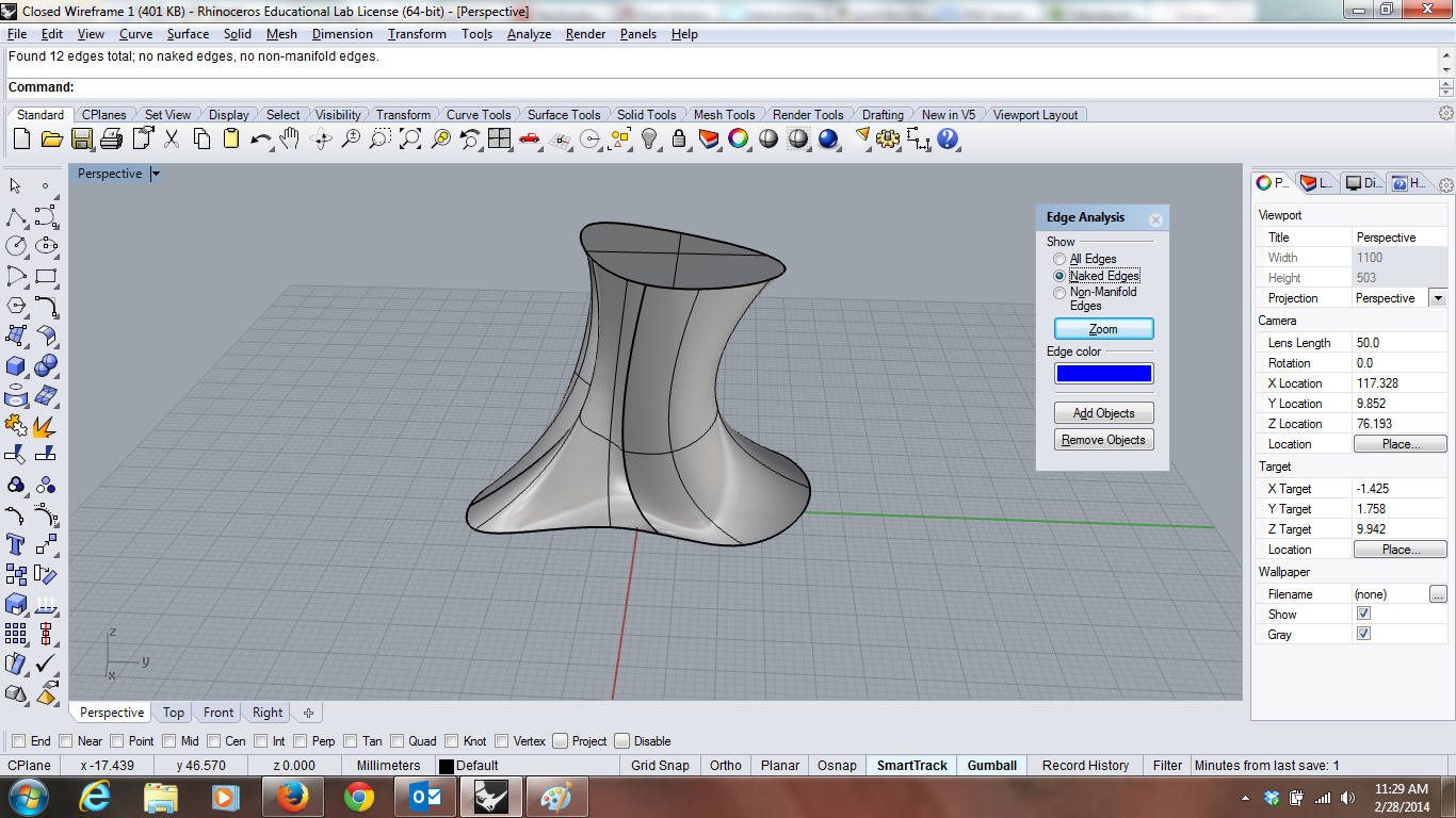
Using splits, joins, and a couple of additional lines, I created the first two shapes and transformed them into 3D Solids:
The curve isn't the prettiest or have the roundest edges, but it worked and had no naked edges (see below):
The cost of this design is $11.50 in white plastic on Shapeways.
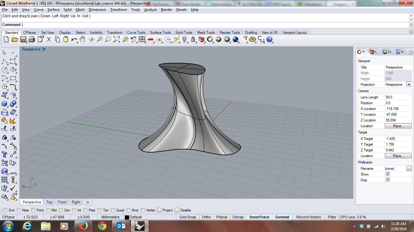
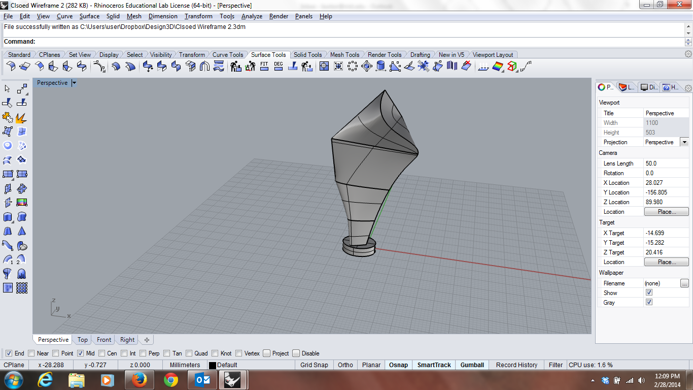
The second shape created was harder. Using the same methods as above, I ended up with a completely closed polysurface with naked edges on the bottom. I tried various methods, including creating surfaces along the bottom to join, but they were unsuccessful. Eventually, I decided that the shape might benefit from having a 'base', which is what I ended up creating below:
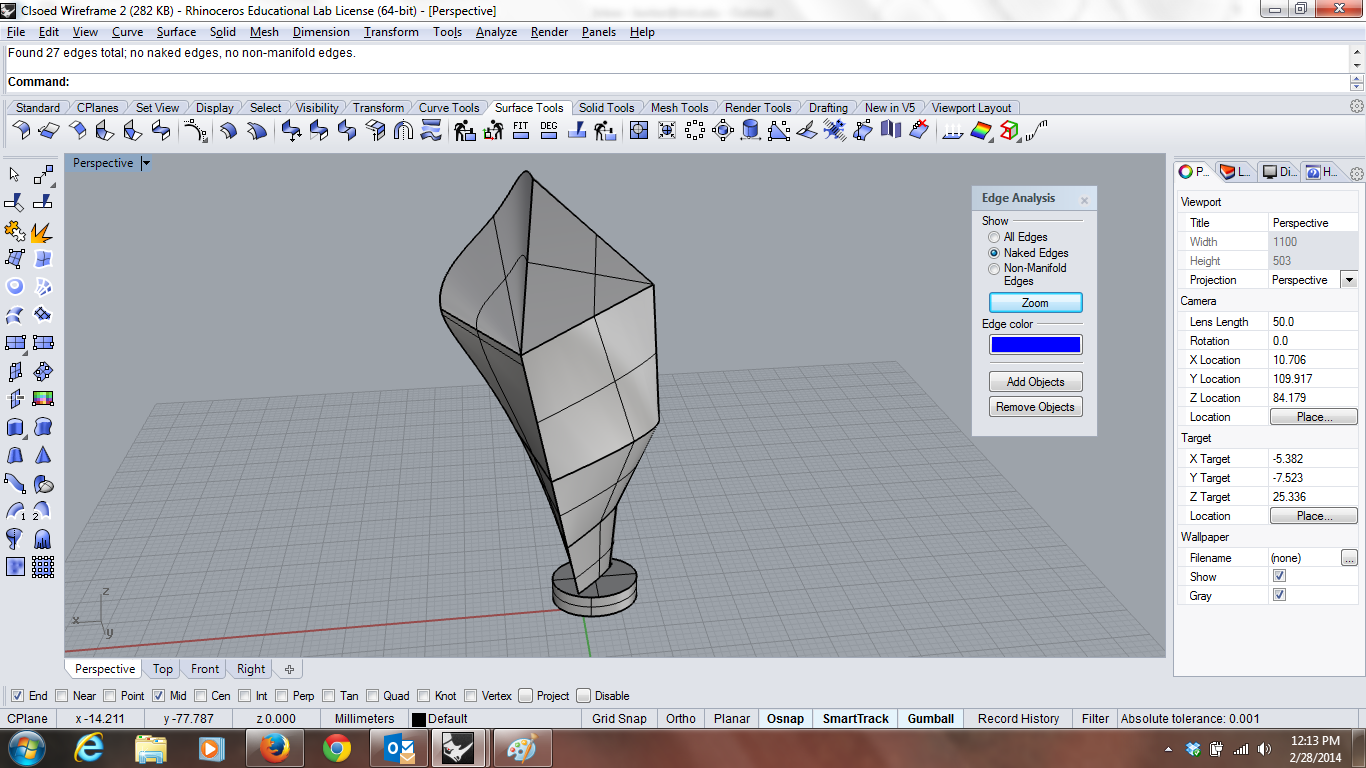
As you can see below, the shape doesn't look incredible but it doesn't have any naked edges:
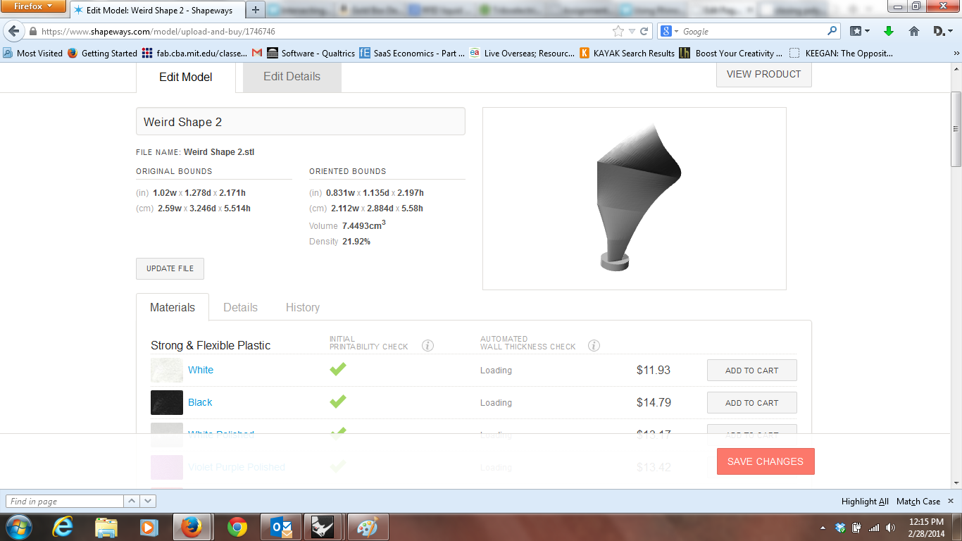
If you are keen on buying my masterpiece, it can be had on Shapeways in luxurious white plastic for $11.93. A steal for something of this quality:
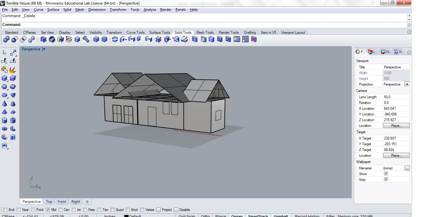
Finally I started playing around with the house, but did not have time to get close to finishing. Anybody who sees a 'Ryan Built' property, should probably stay away from this abomination. Notably, the intuitions for joining shapes and when and how Boolean Union will fail still escape me. The basic operations of creating the shapes I want is getting easier, but it is still not easy to position even things like the windows--using the views has gotten easier, but getting them to stay flush with the surface, adding the right amount of lines, etc. has been harder. The gumball is incredibly useful, but still am not proficient.
Rhino
It took a while to get Rhino installed. It is still a mystery how to use it. As a side note, I notice the drawings now show up in barely visible lines. They show up in my PDF's as red--one of the many mysteries I hope to solve this week.
Starting with the basic objects, I made some pentagons and rotated them, offset them, highlighting repetition of size, and variation in direction.
Originally, I tried more complicated objects but failed as I couldn't figure out how to do anything I really wanted to do. I attempted to recreate Escher's sphere illusion, but failed. Having so failed, I attempted to place whatever you want to call what I traced into a panel. The original idea was to cut off the shapes outside of the panels. Having not figured out how to do that, the shapes remain visible outside of the panels. However, by varying position in the box in the top pane I hoped to evoke different forms of motion. In the bottom pane I hoped to evoke a sense of interaction between the two shapes using position and the natural features of the spheres.
2/21/2014
I have made progress in Rhino, from not being able to do anything to being able to do things poorly. One small step for mankind. For my object I am beginning to work on a 3d model of a camera.
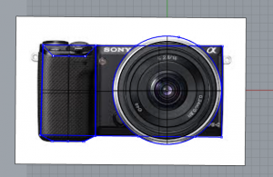
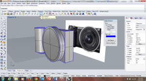
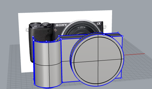
The camera I chose was a simple Sony point and shoot. The reason I chose the object were for the relatively simple beginning outlines, but the relative complex details that will follow in future weeks. To begin, I started with concentric circles of the lens, and then projected those out into 3d space. The rectangle of the camera back was next, which was again a straightforward rectangle.
The hardest part of the project is the shape of the handle for the camera. To do this, I created a polyline surface and rotated 180 degrees. Unfortunately, this created a groove which I have not yet been able to cap. I exploded the surface on the back and extended that surface backward to create the rest of the grip. Capping both polysurfaces and doing a bunch of boolean unions created the single image we have here. As you can see in the image above, there are no naked edges: my camera is waterproof!
The full camera is coming along. I would like to create the more complex top with the buttons next, but while the tutorial guy made it look easy I expect he's had a lot more practice than I have.
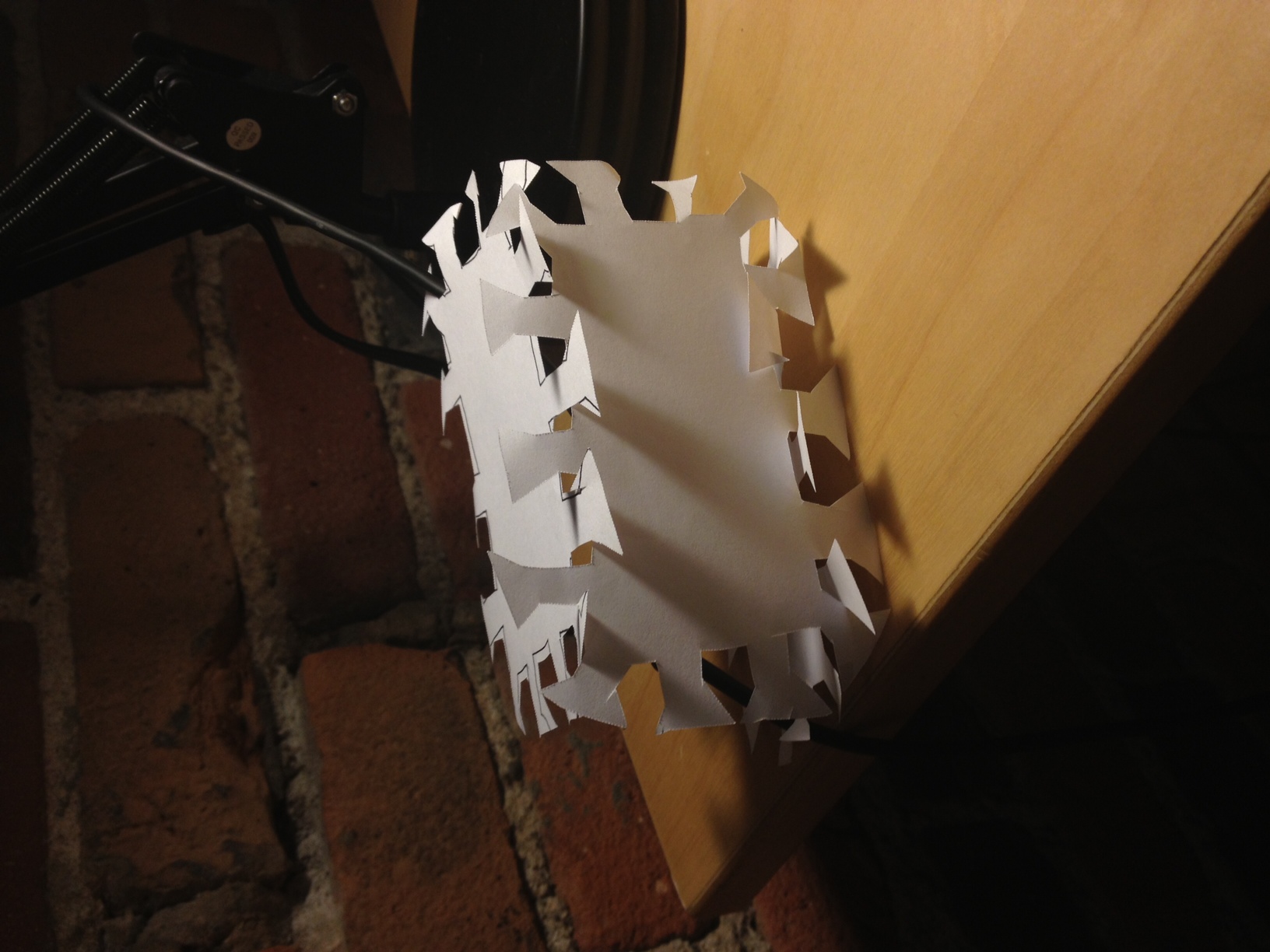
Paper BoxFor the paper box, I looked at the reading and realized the secret would be to create some interlocking symmetry that I could exploit for construction purposes. Not being an expert, I took some inspiration from the simple triangle cuts I found perusing acrylic and cardboard boxes. However, I didn't know whether that would hold up with real paper. Rather than model in Rhino, which would take 10x the time, I drew the shapes out by hand and cut 3 sheets of paper as a proof of concept.
It worked.
It may surprise you that I call this 'working' but it basically holds together even with 3 sides.
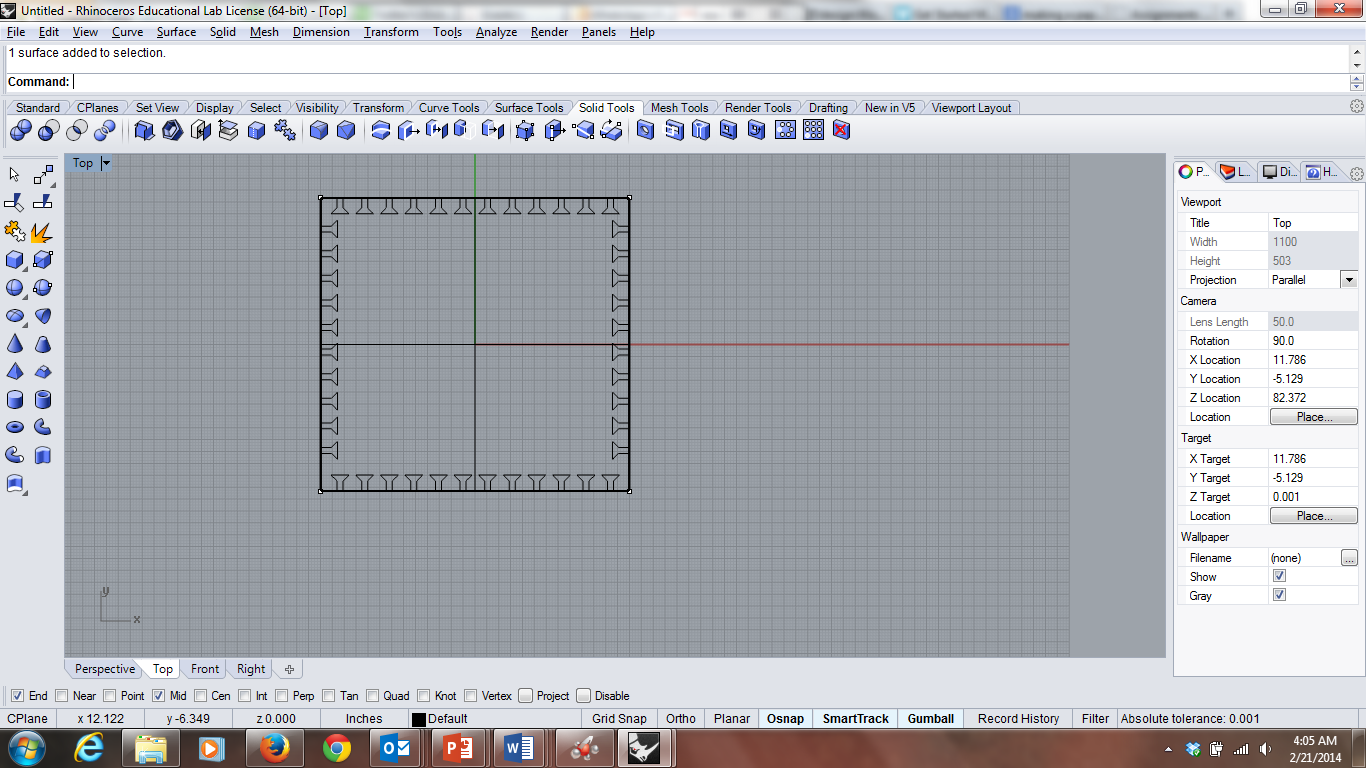
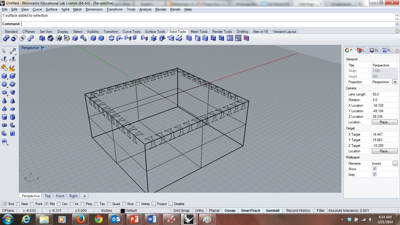
I began to design this in rhino using the line tool and the linear array tool to ensure even spacing. I didn't know how to do measurements, so I centered my cube around the origin and did the measurements by hand using the grid lines.
It turns out looking pretty good. Using the rotation features, I have been able to get one side of the other faces of the box done. However, I don't know how to translate these onto the other faces, and can't seem to cut the box and mirror it (the trick the tutorial suggested). So I leave my paper box unfinished for now.

