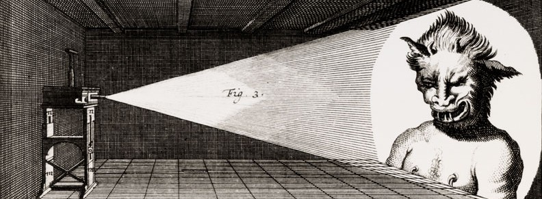
As an admirer of J.R.R. Tolkien’s Middle-Earth, I strove to replicate his hidden message on the Doors of Durin, which is the western entrance to the Dwarven city of Khazad-dûm. These Doors were only visible with starlight and moonlight, and so could not be seen by sunlight during the day. To generate moonlight I implemented a materials-based approach. My rationale for this was due to the fact that moonlight has a spectral signature not limited to a single wavelength. This is quite logical, as moonlight is largely reflected sunlight off the Moon’s surface, and sunlight extends over the entire electromagnetic spectrum. In 1929, French astronomer Bernard Lyot made a volcanic ash mixture with identical optical characteristics as the lunar rocks. Specifically, he illustrated a near-perfect match of light polarization among the two materials over all phase angles.
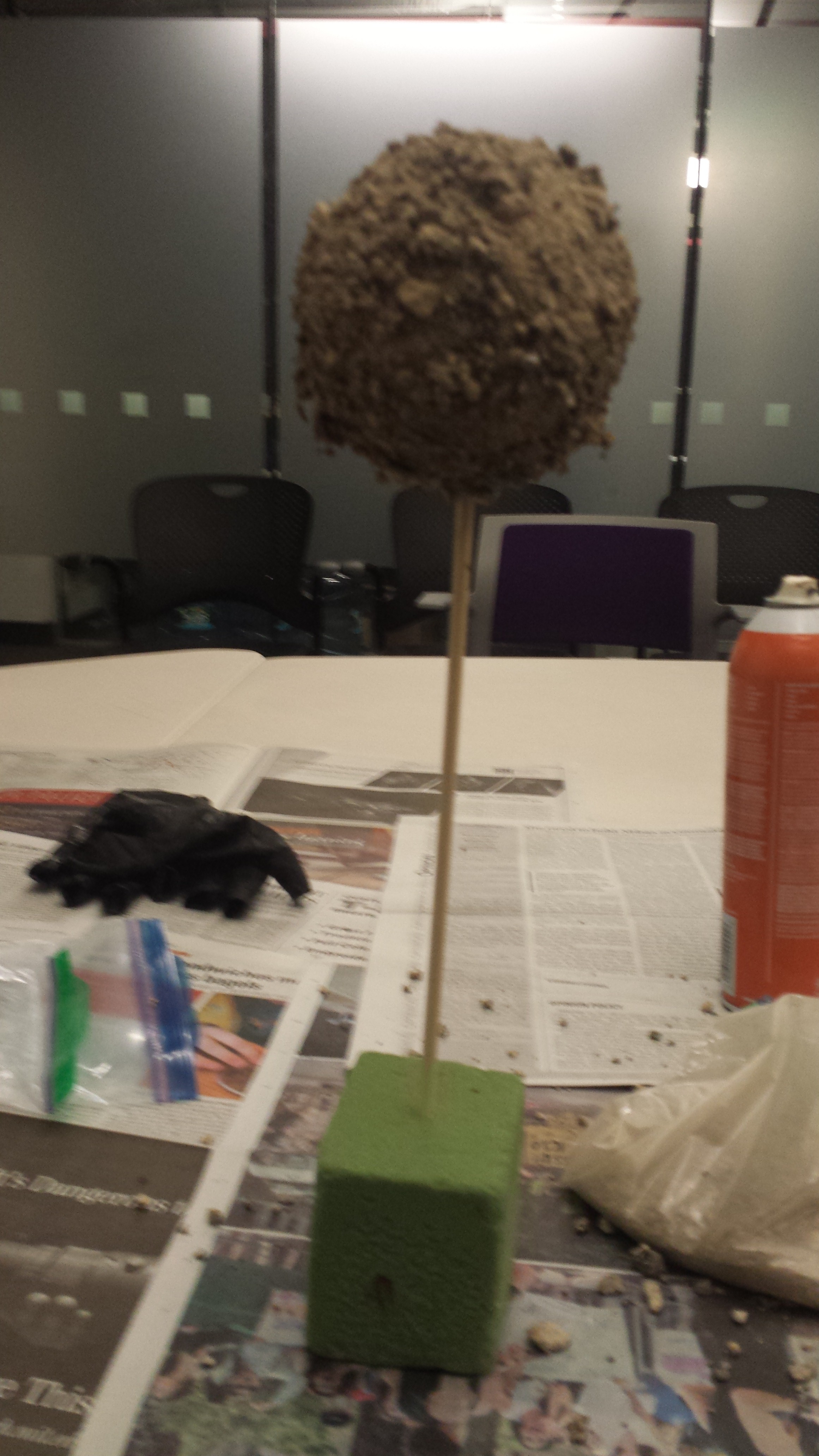
I made a model of the Moon by gluing volcanic ashes from St. Helena on a green Styrofoam sphere with a spray adhesive. The circumference of the sphere prior to applying the ashes was approximately 31 centimeters; after gluing the ashes, the circumference increased to 33 centimeters. Therefore, on average, the thickness of the ash layer on my model Moon is 2 centimeters. To elevate the Moon over a surface, I stuck one end of a wooden dowel through part of the Styrofoam, such that my model looked like a lollipop. The other end of the dowel was put into a green Styrofoam rectangular prism that rested on the table. Below is a picture of this constructed model.
To compare my model with the actual Moon, I determined the intrinsic brightness of both objects using the equation:
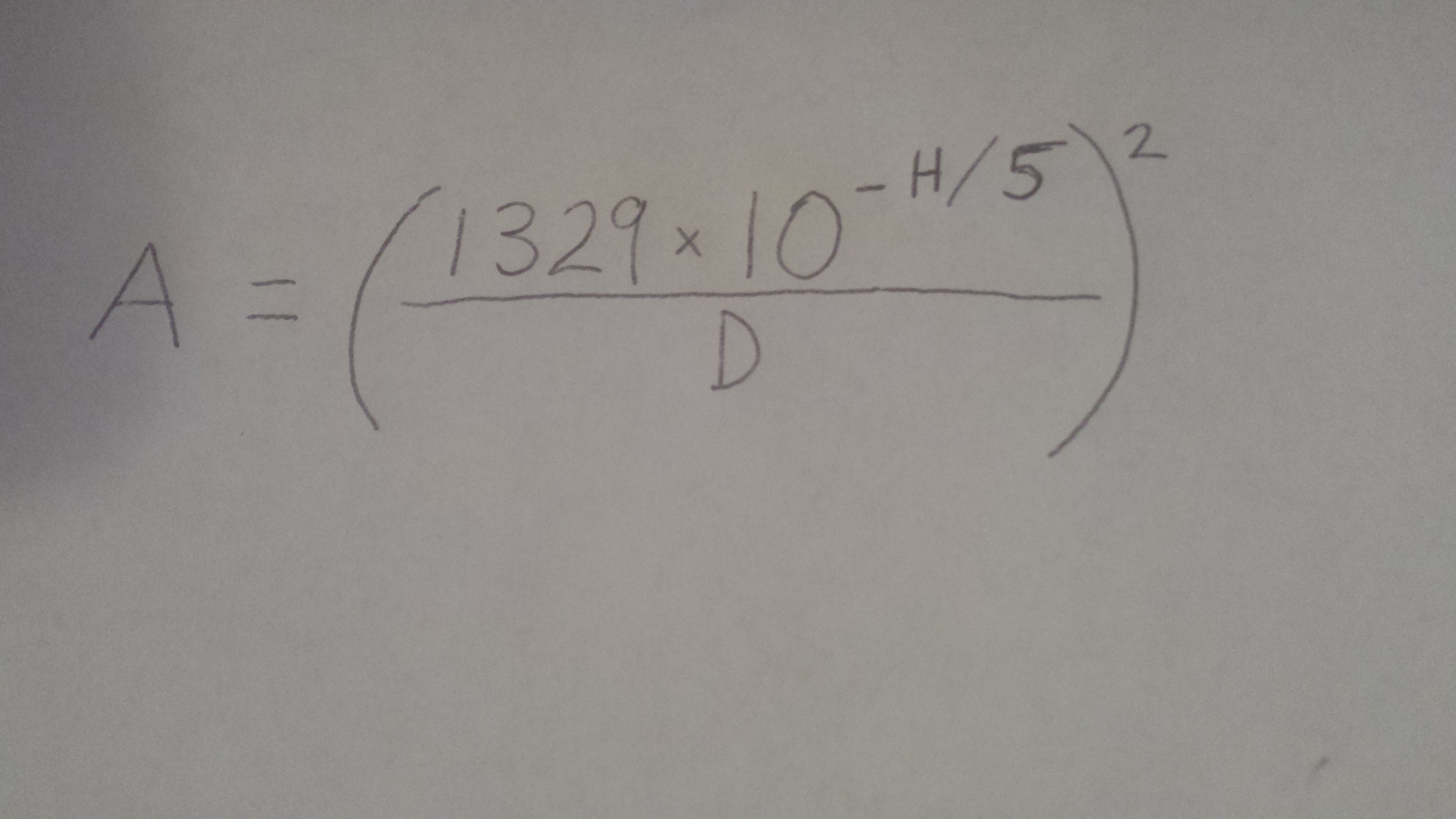
Here, A is the albedo (which is the fraction of incident light reflected off the Moon), H is the absolute magnitude (the brightness of the Moon if positioned one astronomical unit away; this distance is about the distance from the Earth to the Sun: 1 AU = 149,597,870,700 meters), and D is the Moon’s diameter in kilometers. The Moon’s albedo is approximately 12 percent. Substituting this value into the above equation and calculating the diameter by dividing the circumference by pi and converting to kilometers (D = 1.0504 x 10⁻⁴ km), the absolute magnitude for my model Moon is H = 37.8129. The absolute magnitude for the real Moon is quoted as HMoon = 0.25. Objects that are intrinsically brighter than others have a lower absolute magnitude; the absolute magnitude can even be a negative quantity for very bright materials. It is evident from the above equation that the diameter and absolute magnitude are related in a logarithmic fashion. To find how many times brighter the model Moon is than the actual Moon, simply take the fifth root of 100
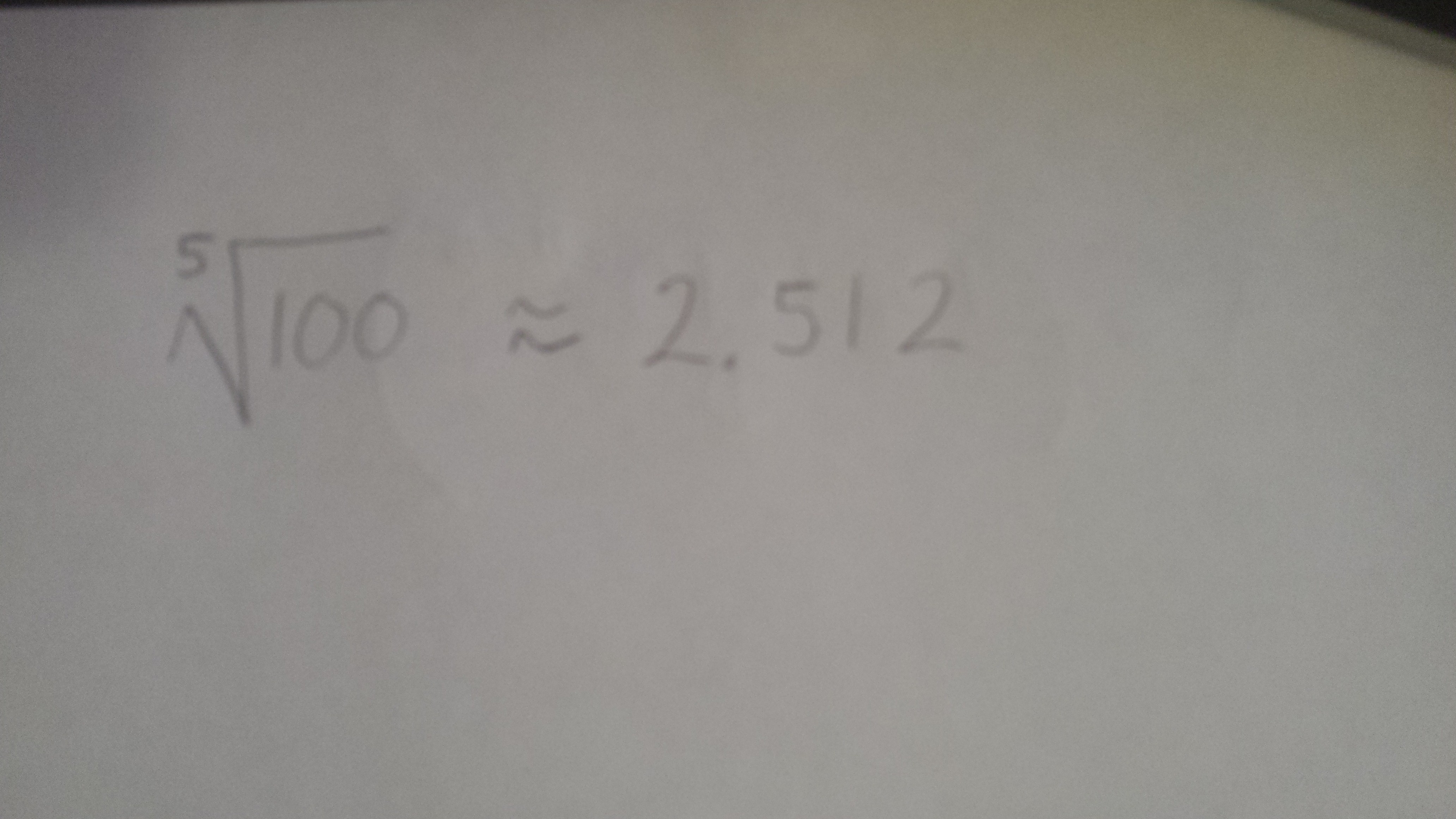
and raise it to the power of the positive difference between the absolute magnitudes. Thus, the Moon is
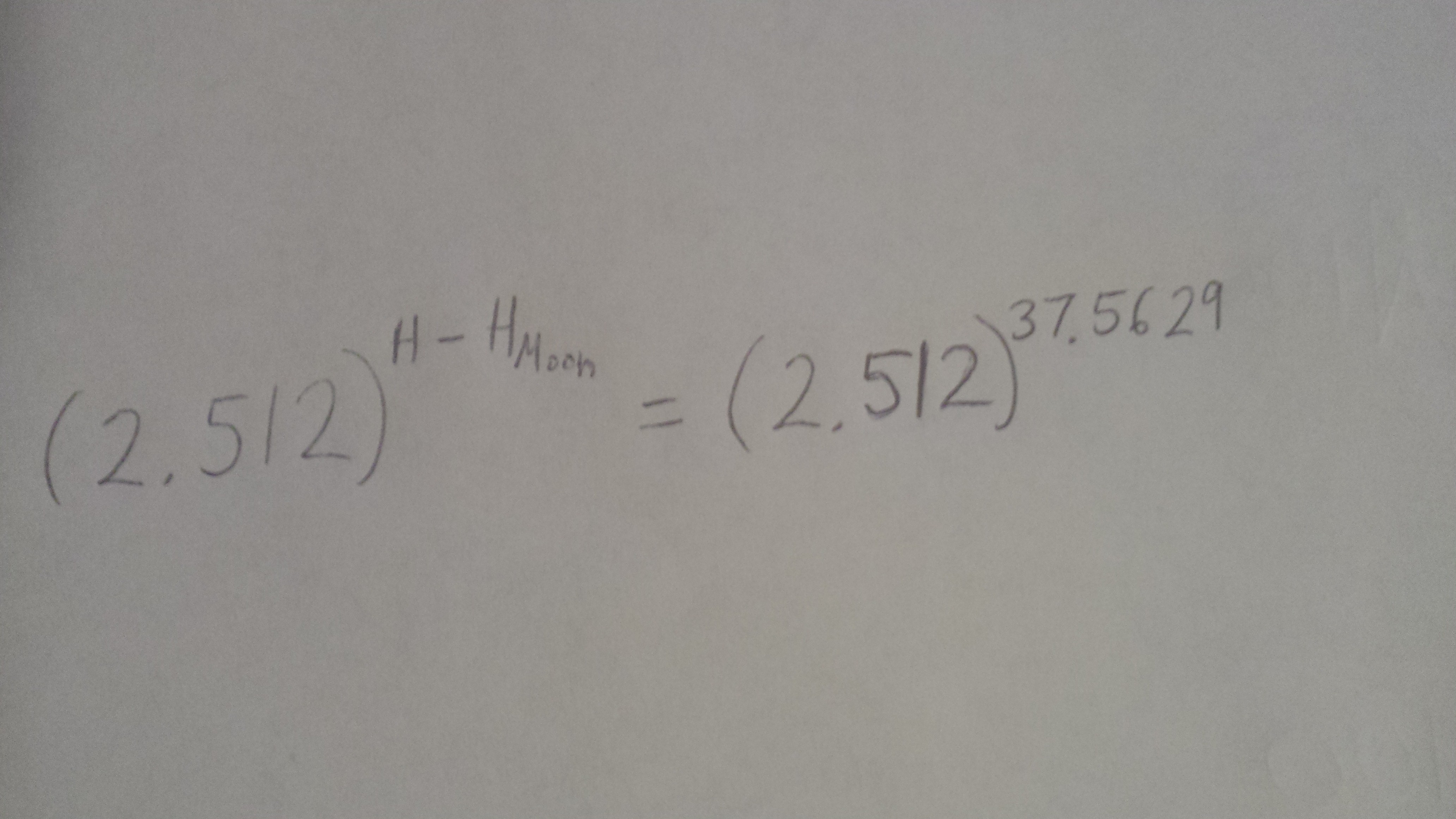
≈ 1.06145×10¹⁵ times brighter than my sphere made with volcanic ash.
To produce an ink that was invisible under illumination by sunlight but visible under moonlight, I resorted to a contrast scheme. That is, I applied ink of nearly identical color as the parchment I wrote on. The catch is that the ink needed to be slightly different than the paper with an additional color component to differentiate between the Sun and Moons’ spectra. Sunlight consists of equal parts of red, green, and blue components. Moonlight, however, possesses a noticeably stronger red component and a weaker blue component. Many people are oblivious of this fact; the reasoning deals with the Purkinje effect, which makes objects in darker settings appear bluer to us, as a result of the rods in human eyes.
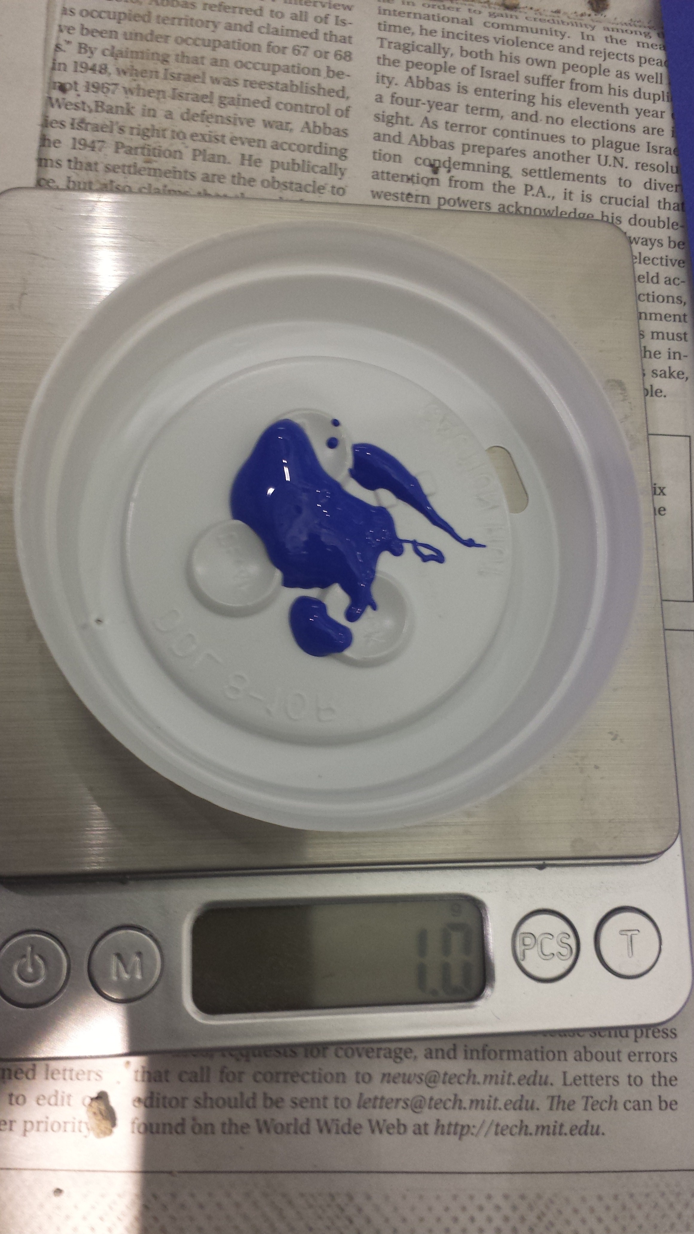
Knowing that the Purkinje effect would not prove a significant issue with a light source positioned near my Moon to brightly reflect on my parchment, I tried two different contrast schemes. One used blue paper with a blue ink that had a tinge of black added. The second used black paper with black ink that had a tinge of red added. The inks were mixed and applied using a paintbrush. Upon writing with the inks, I quickly realized that they had a different color than their corresponding parchments even before the mixing of a secondary color. Thus, testing was performed to make inks of exactly the same colors as the blue and black parchments. I began with a rough test, simply adding spoonfuls of primary ink to dabs of secondary ink. After doing this, I recognized that a stricter method was necessary. My first attempt to yield a more precise test was to use eye droppers and simply count the number of drops I added of each color. This plan was squashed, however, upon noticing that the ink was too viscous to exit the droppers. My alternative approach made use of a scale to weigh quantities of the primary colors; below is a picture of the scale measuring one gram of blue ink.
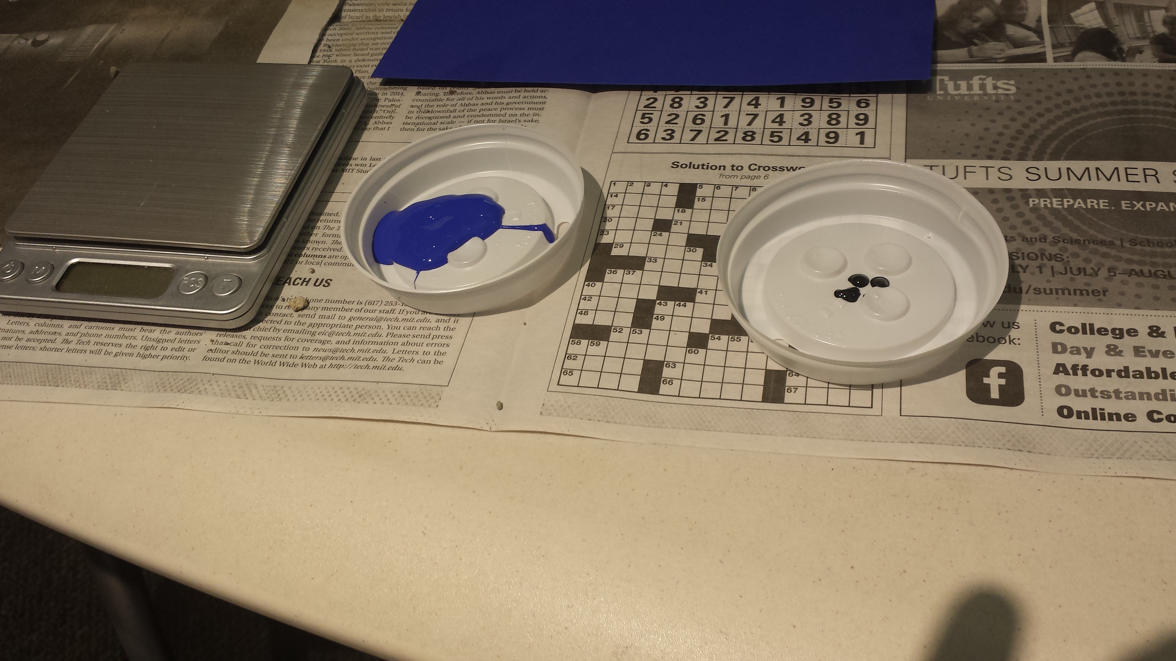
As mixing a quantity of the secondary color that was undetectable with the scale with several grams of the primary color went very far in changing the resultant color, and understanding that I did not want to devote an umpteen number of grams of primary ink for each trial, I carefully made depressions with a chopstick for my measure of the secondary ink. Shown below are typical quantities of the two inks; notice the three depressions of the black ink.
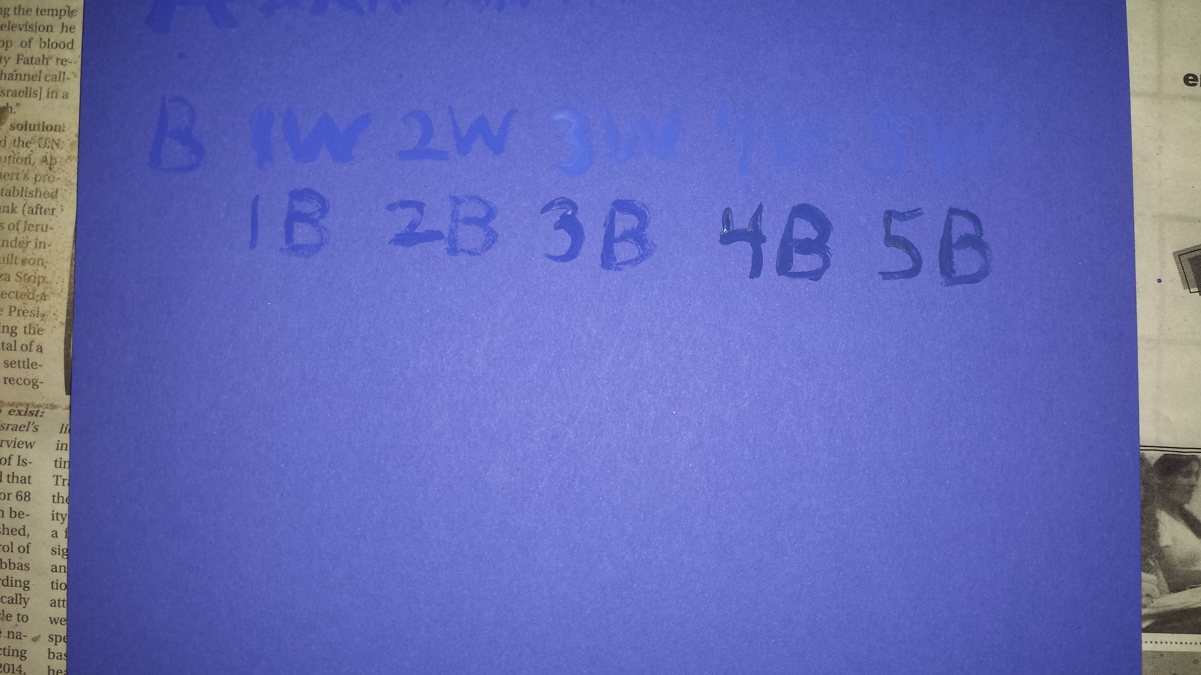
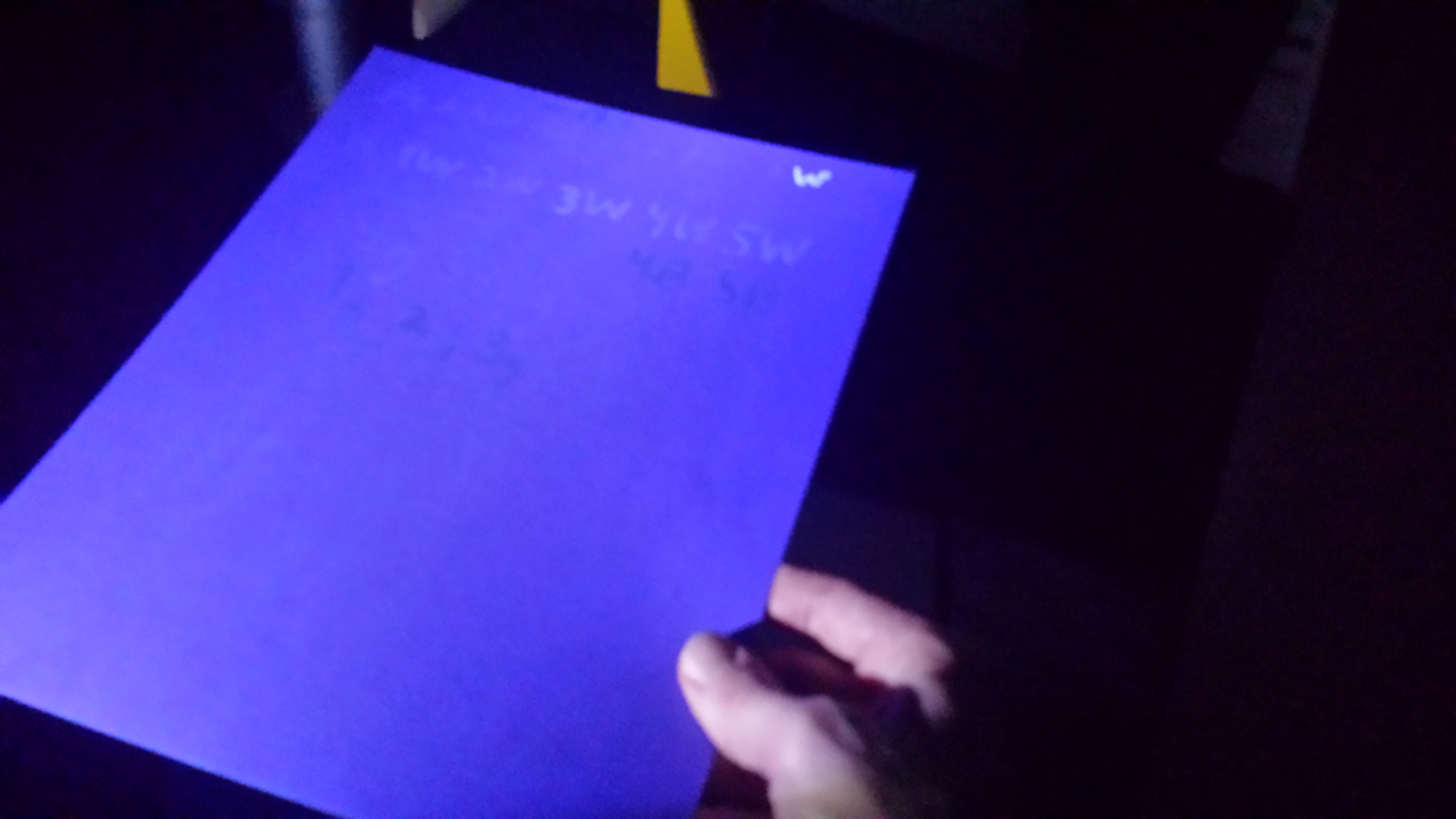
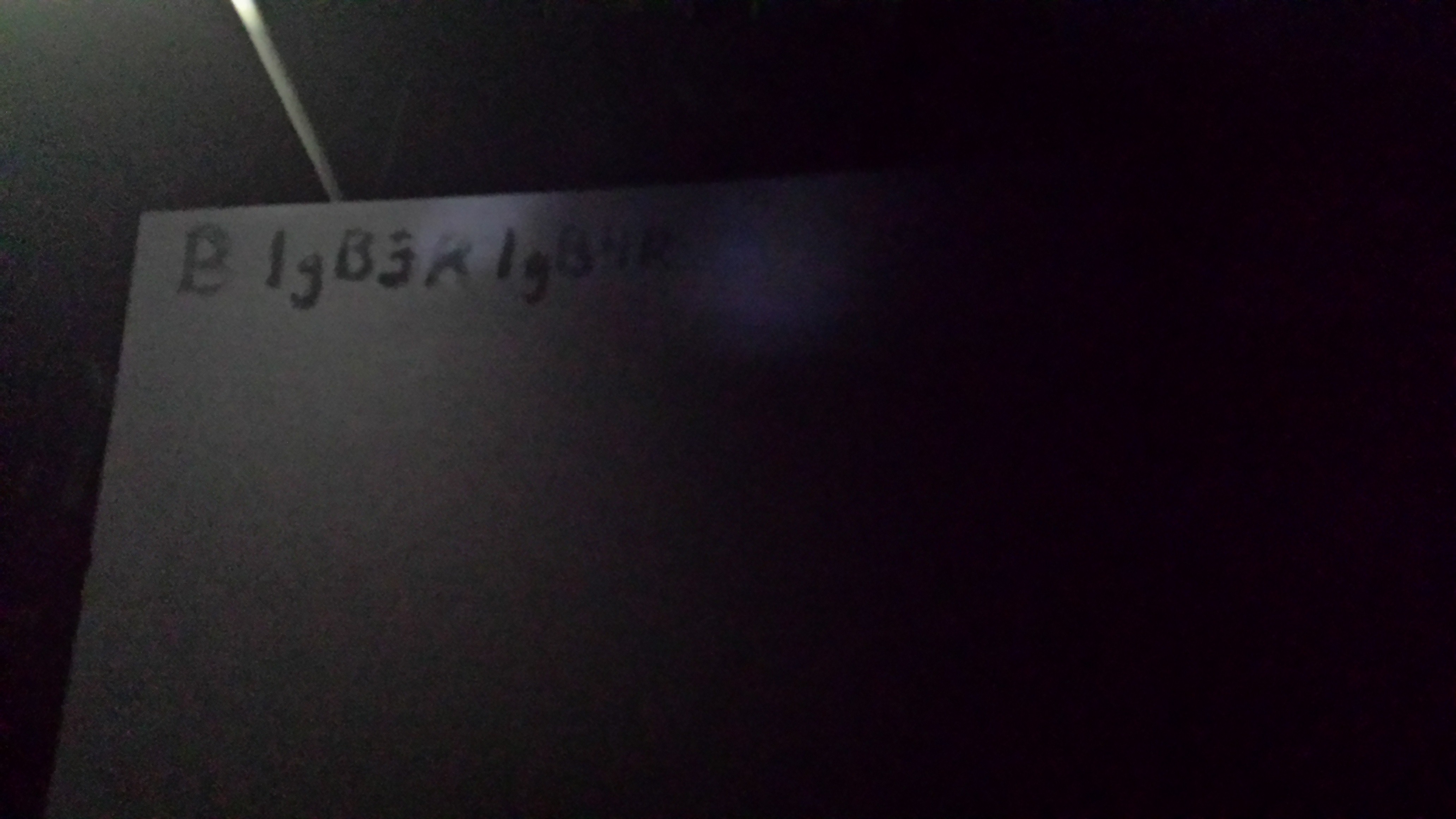
Pictures of the ink tests are shown below. The first picture shows the rough test performed with spoonfuls of blue ink and large dabs of black ink. All the character sets are labels, each written with one spoonful of blue ink: B is blue (no black), 1W is one spoonful of blue ink mixed with one dab of white ink, 2W has two dabs of white ink,…, 4B has two dabs of black ink, and 5B has 5 dabs of black ink. Don’t be fooled by the apparent disappearance of the 4W and 5W in the photo. From the proper viewing angle, they both are quite bright, and clearly not the same color as the parchment. The second picture validates this assertion. Notice how bright the 4W and 5W are here. This picture contains additional tests. The W on the top right denotes plain white ink, clearly visible in comparison to all other colors. Looking closely at the middle of the page, one can spot the character sets 1g, 2g, 3g. These represent grams of blue ink mixed with exactly 10 depressions of black ink. By my inspection, I determined that the 3g appeared the least noticeable. Therefore, I used the recipe of 3 grams blue ink mixed with 10 chopstick depressions of black ink to write the hidden message. The third picture shows testing done with the black ink. This was less extensive for two reasons. One, the black ink more closely matched the black parchment to begin with. And two, by the time I began testing on the black parchment, I had already performed extensive testing with the blue parchment, so I proceeded directly with using the scale. The code on this sheet is: B- black ink only, 1gB3R- 1 gram black ink and 3 depressions of red ink, and 1gB4R- 1 gram black ink and 4 depressions of red ink. To write the hidden message, I chose 1gB3R as my recipe, as the extra amount of red in 1gB4R resulted in an ink that appeared more visible in ordinary light, without any noticeable improvement under moonlight.
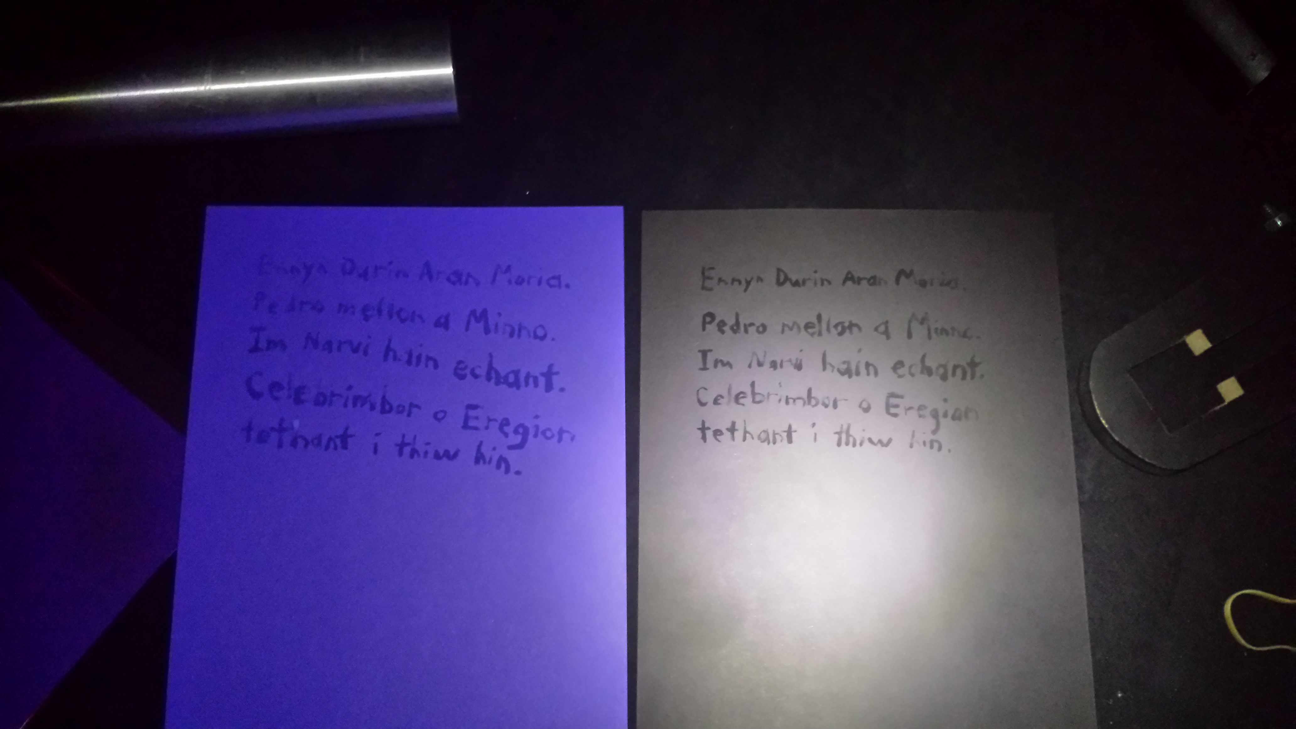
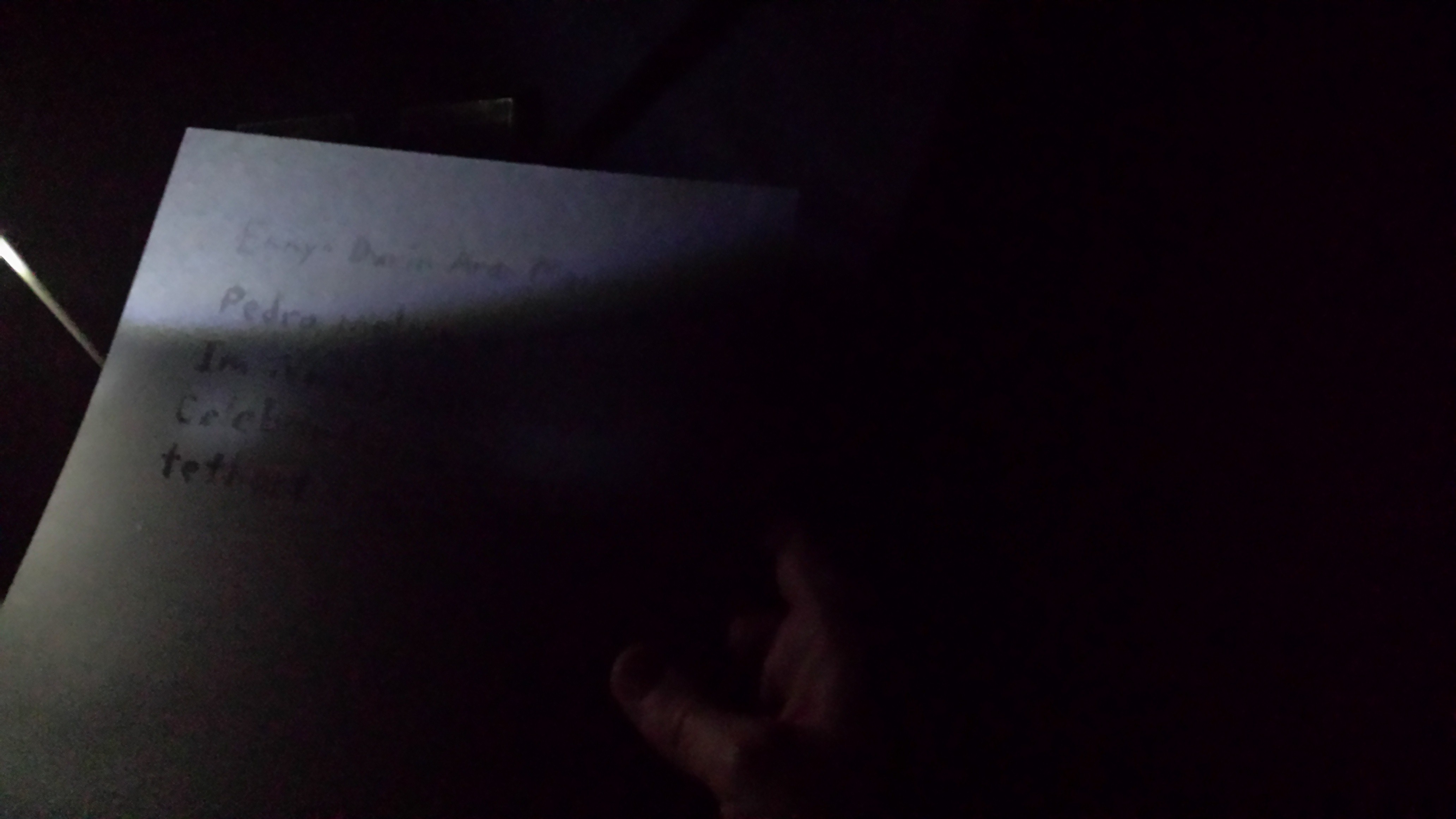
The secret message I wrote on both the blue and black parchments is the same one that appears on the Doors of Durin. It is written in the language of the Elves.
Ennyn Durin Aran Moria.
Pedro mellon a Minno.
Im Narvi hain echant.
Celebrimbor o Eregion tethant i thiw hin.
This translates in English as
The Doors of Durin, Lord of Moria.
Speak, friend, and enter.
I, Narvi, made them.
Celebrimbor of Hollin drew these signs.
Below are pictures of this message written in Elvish on both colored parchments.
To represent the Sun, I employed an LED flashlight with a luminous flux of 37 lumens. The Sun has a luminous flux of 3.6×1028 lumens; that is on the order of 10 thousand yottalumens (Ylm). Given that the distance from the Moon to the Sun ranges from about 147 million kilometers to 152 million kilometers, thereby taking a rough average of 150 million kilometers, in order for the ratio of luminous flux to distance to be equivalent for my contrived system, the LED flashlight must be placed approximately 1.5417×10⁻¹⁶ meters from the model Moon. This is quite fascinating but hardly an issue, as the light loss over reasonable distances of several meters is minimal.
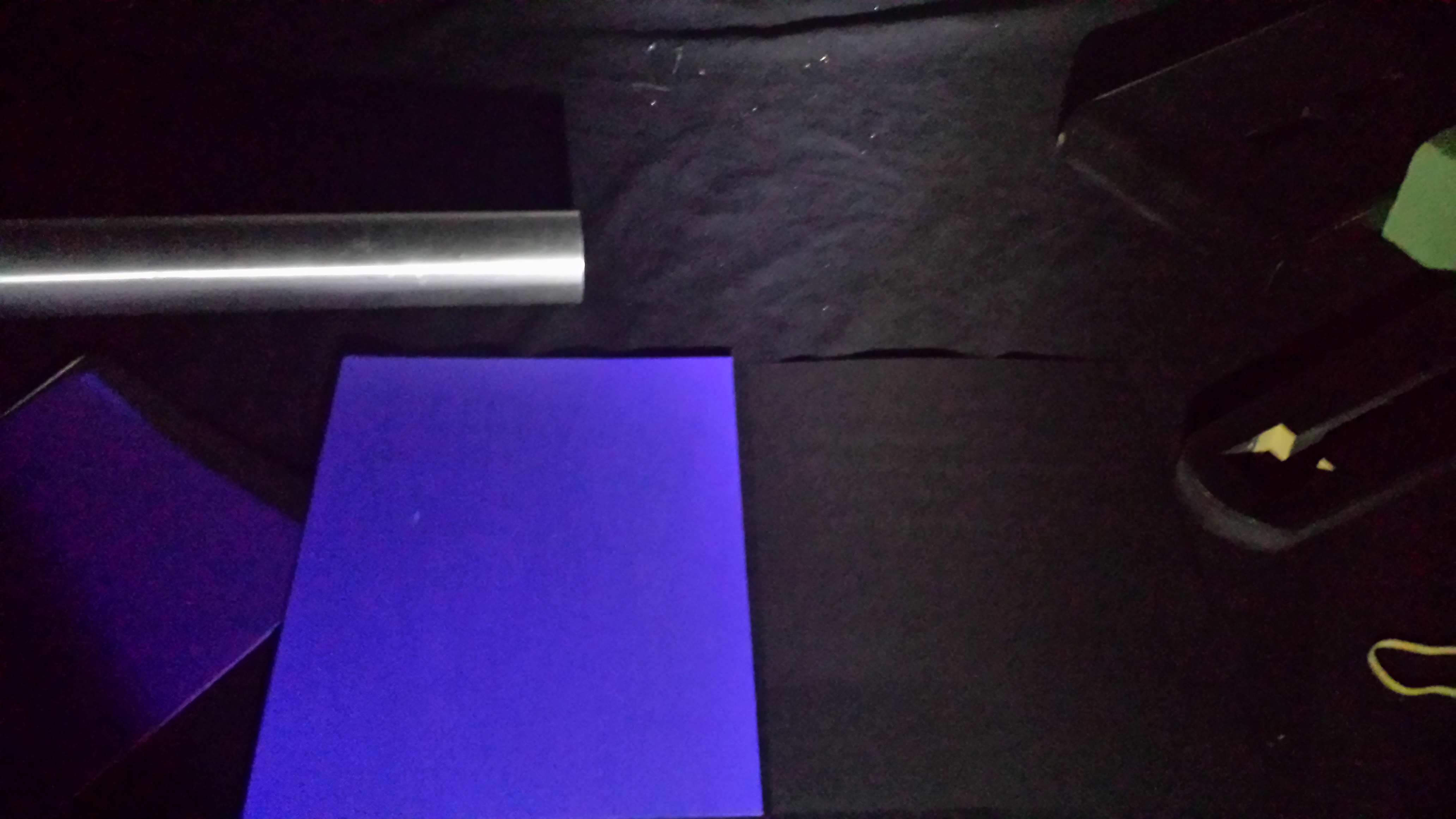
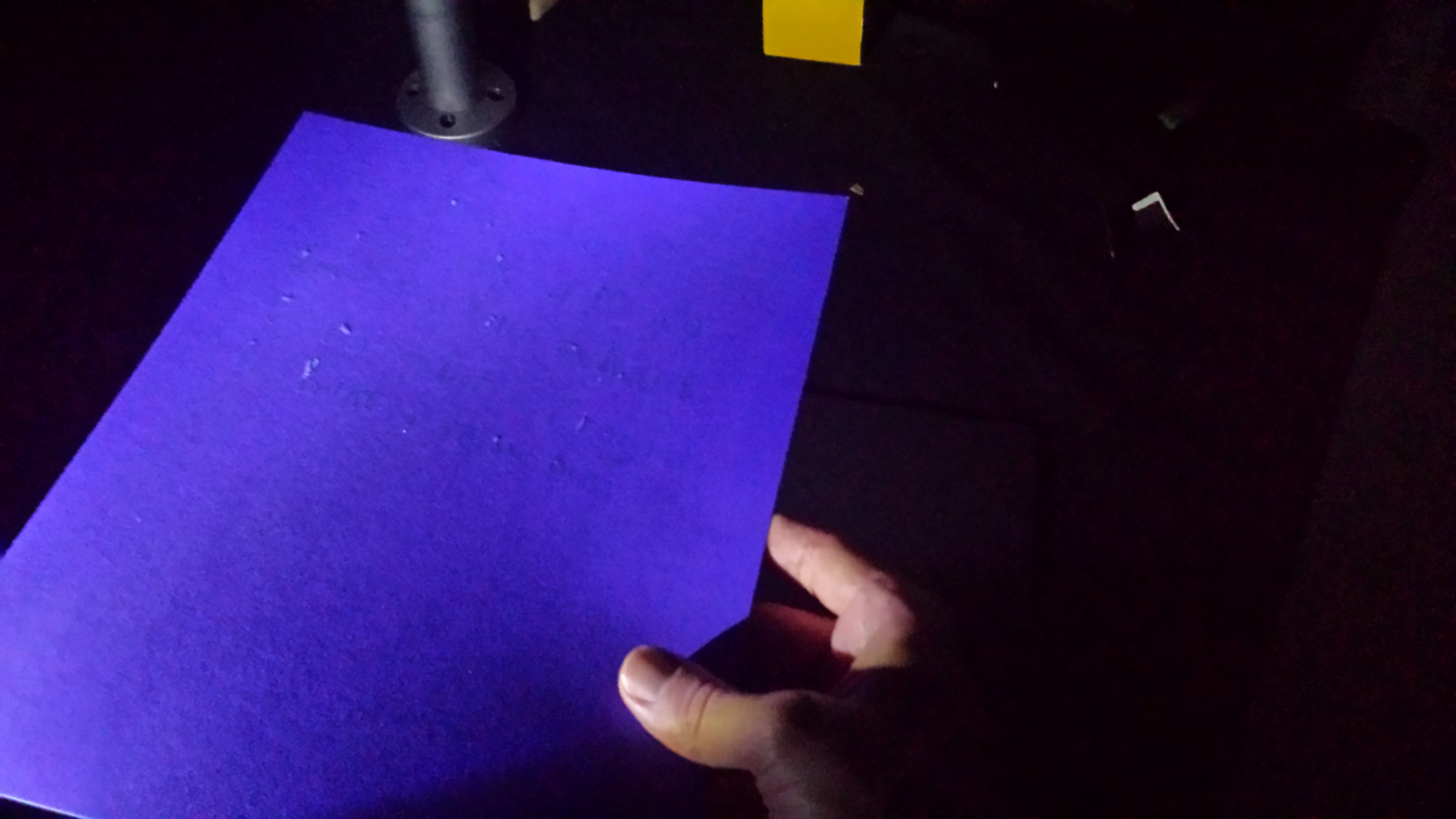
By turning each parchment at an angle with respect to the flashlight, the writing appeared invisible. Examine the three pictures below for the blue and black parchments to verify this.
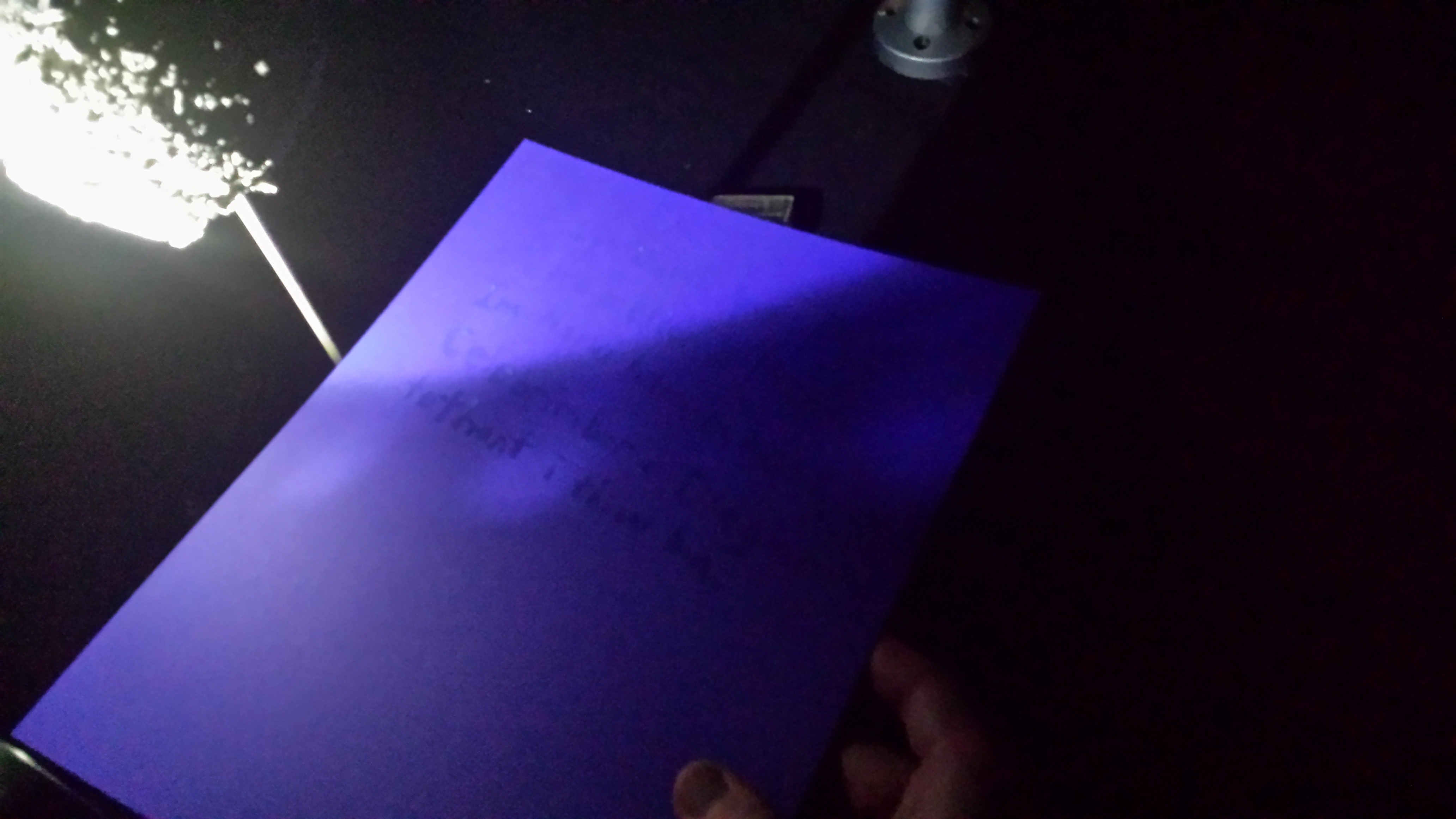
To produce moonlight the flashlight was shined on the volcanic ash sphere. For the effect to be astounding, one should already place the parchment at a viewing angle such that it is invisible with the flashlight shining on it, and merely move the Moon into the light path without shifting the parchment at all. The two pictures below were taken exercising this approach; the first is the blue parchment and the second is the black parchment, both under moonlight. Observe that since the Moon I constructed is small in relation to the parchment, the message is not entirely visible. One must shift the paper towards the Moon to read content on the right-hand side. Nevertheless, you can still pretend to be Gandalf.
The challenge, of course, is to develop an ink that is invisible under sunlight for all viewing angles, not just a restricted angular range, and that is also clearly seen under moonlight. I will endeavor to rectify this problem for my final project.