
TraceForm
Concept
TraceFrom is physicalizing spatial visualizations with the purpose of aiding visually impaired students in the context of a learning environment.
By using the tangible medium “Transform” we are able to turn two-dimensional digital representations of plots, graphs and sketches into physical representations that visually impaired students can interact with. Such students would typically use a screen reader software to browse through digital content, and once encountering a graph either automatically skip it or hear a simplistic label description such as “graph for velocity and time”. Not being able to easily understand the information communicated with a graph can greatly stunt the student’s progress. We propose to implement a software and hardware system that will accompany the screen reader of a web page, and upon encountering a graph, will suggest a physicalized version of that graph on the nearby TraceForm. It will then animate the given scenario in a tangible dynamic representation.
Inspiration, Motivation
Graphical representations is a key element in our everyday lives and education. The use of coordinate systems, bar charts and similar plots are essential tools to explain a broad range of concepts within mathematics, physics, economics and social sciences to name a few. With the rise of graphical user interfaces (GUI’s) the cost of being able to interact, alter and visualise data has approached zero, creating a great tool for understanding abstract concepts such as motion profiles or curve derivatives. However, in this evolution visually-impaired students are left even further behind.
We have developed TraceForm with the aim of providing a tool that will enable visually-impaired students to gain the benefits of being able to dynamically explore and alter spatial representations.
Affordances, Design Decisions, Constraints
Transform as an interface
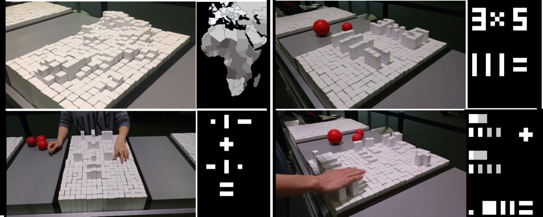
For our initial prototyping, and before we decided to focus on visually impaired students as our user group, we faced challenges in clearly communicating the use of the platform’s UI. In this initial work we experimented with the use of transform as a “physical” calculator that would provide a better understanding of concepts such as division and multiplication. However in most scenarios it wasn’t intuitive how to interact with the transform given that the low resolution of Transform and the uniform shape and colors of all pins provided no signifiers of how to interact with the device.
Furthermore the affordances of the pins is a matter of pushing rather than pulling since grabbing onto the pins when the surroundings are in same level is difficult. In this configuration it however gets challenging to visually get an overview of the inputs, and pressing individual pins becomes somewhat awkward.
Our conclusion was that in general the use of Transform as an interface to input and modify data turned out to be cumbersome and in most perspectives inferior to any GUI.
Focus on visual impaired
At this point we shifted our focus to visually impaired users, and the more “passive” application of converting illustrations/diagrams/plots into representations on the Transform. By doing so we avoided the requirement of having an interface upon which the user should be able to construct scenarios. Instead, we could focus on translating graphical spatial representations onto the transform and allowing simple investigative operations to be performed.
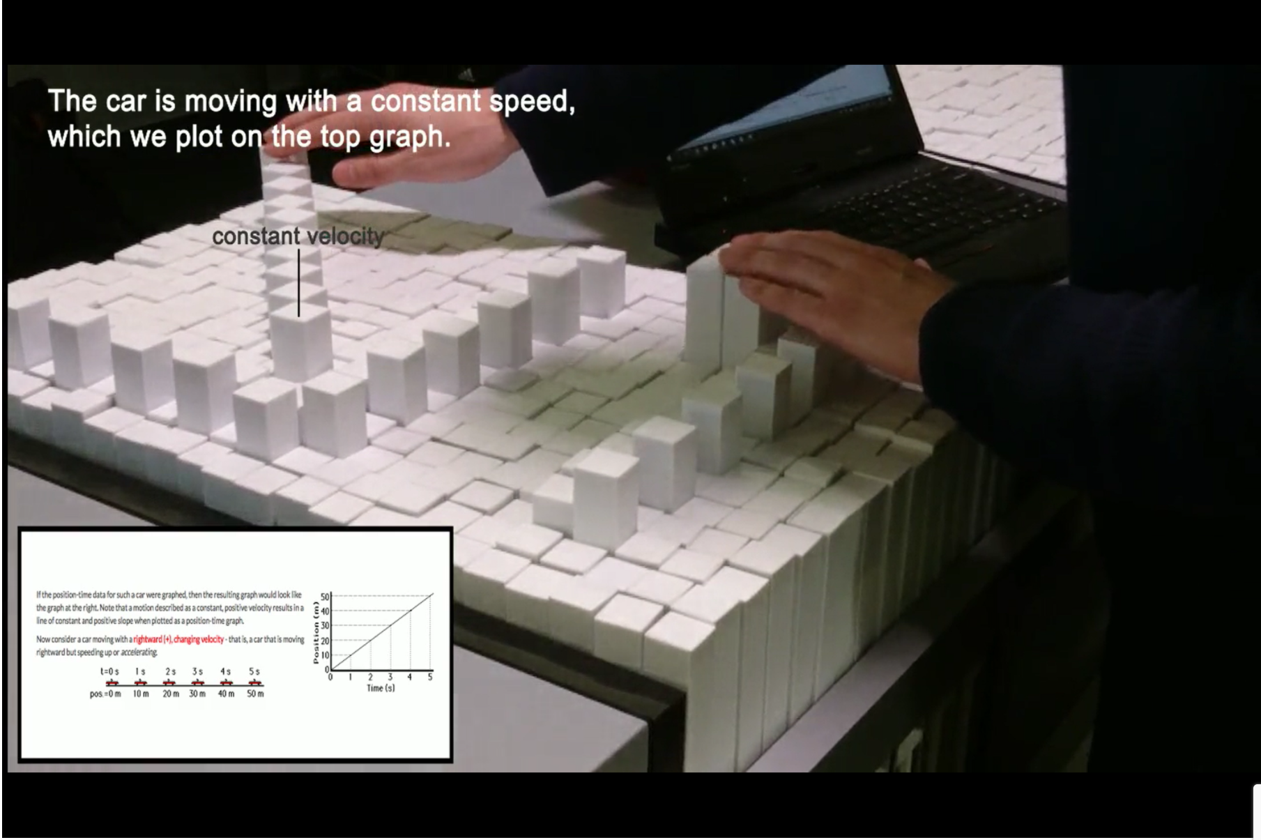
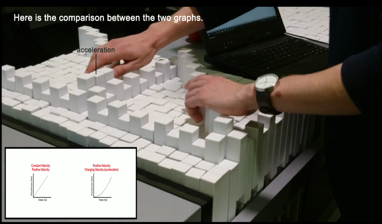
One of Transforms greatest strengths is its ability to dynamically alter its representation in real time and for that reason we chose to focus on the topic of motion (basic physics of linear uniform velocity and acceleration). The programmable pins allowed us to mimic different type of motions; constant and accelerating movements, fast and slow velocities and so forth.
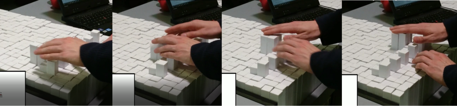
The constraint of having an array of dynamic pins, is that each pin require an individual motor to control, thereby limiting the resolution of the table. As an effect one of our scenarios in which we compare an accelerating velocity and that of a constant, the difference was challenging for our blind user tester to notice at first. Although it’s visually easy to spot, the fact that one can only feel a few test-points simultaneously made it difficult to do the comparison of a vague local trend.
Implementation
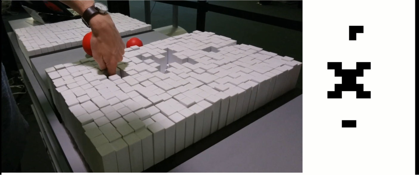
In order to spend the majority of our effort on the concept prototyping rather than the technical implementation we chose to control the TransForm in “scripted mode”, essentially meaning that we pre-programmed certain scenarios which was the played out on the table. The transform supports an input of a simple grayscale video, in which each individual table has a resolution of 24×16 px. The amount of grey determine the height of the pins (with thresholds from 50-210). We used a simple online program “PixelArt” to draw our scenarios pin-by-pin, created a storyboard within this app and turned it into a GIF.
![]()
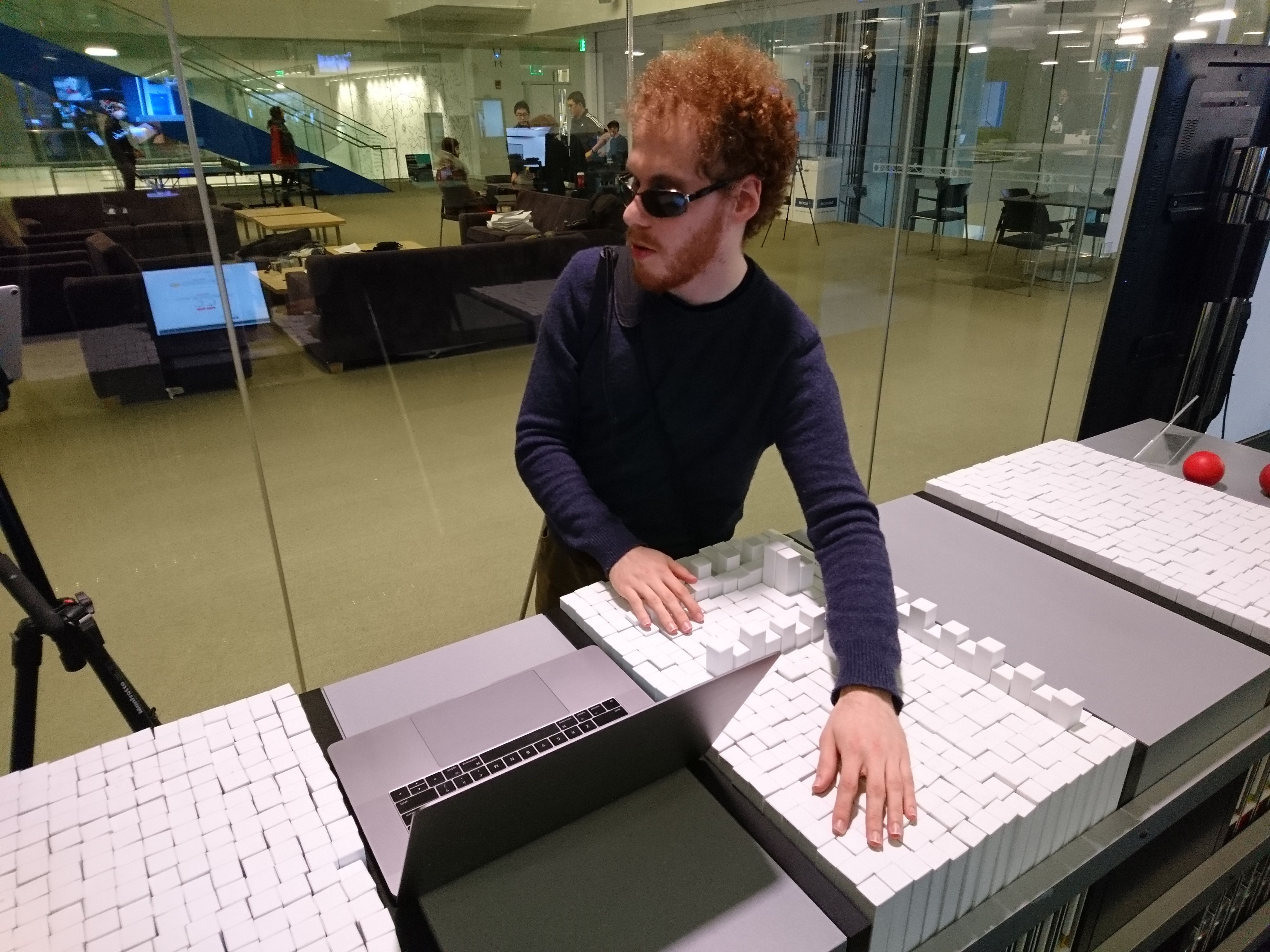
With the help of our blind test-user Matthew Shifrin we used the pre-programmed scenarios to test out different type of interactions. He provided us with valuable feedback and ideas upon the heights of pins, how the plots were mapped and what should happen when you interacted with the pins by either tapping, holding or doing other actions. Due to the ease of which new scenarios could be changed we were able to adapt and implement and test different type of operations throughout a session of a few hours with the help of Matthew.
Final Experience, Lessons Learned
The final concept was made around the scenario of an online ressource on p-t graphs (physics, motion) found here, http://www.physicsclassroom.com/class/1DKin/Lesson-3/The-Meaning-of-Shape-for-a-p-t-Graph.
As the user listens to the text through a text-to-speech program, the software will prompt whether the user would like the encountered images physicalized on TraceForm. We let our test user interact with the webpage as he would normally browse a new source of information, using his prefered audio-to-text software and then provided the physicilisations of the pre-programmed scenarios as our user progressed through the page.
Through these tests we were able to identify a range of important learnings such as:
- Audio cues: One of the first reactions from our user, was the need to have points speak out their coordinate if pressed briefly. The format should be as compact as possible i.e. “four comma three”. If one wanted more in depth information such as the unit of the axes, the user suggested that one should simply double-tap or hold the pin for a longer period
- Care for use of pin heights: In the prototype each pin represented a value of 0.5 from the original graphical based sketches, and we had chosen to heighten the pins which equalled whole numbers (1,2,3 etc.). The difference in height was very clear, and marked these ticks out as appearing very important. Unless the ticks are of important matter, the user suggested that these were simply leveled with the entire axis or only subtle heightened.
- Difficult to observe trends in low resolution: By visually inspecting a low-resolution graph it’s possible to see the trend and interpret whether it is in fact supposed to represent a straight or perhaps increasingly steep trend rather easily. This is however not as straightforward if only using a few contact-points at once if inspecting the graph with one’s hands. As a consequence the user at times had a hard time distinguishing the graph representing an accelerating motion and that of a linear velocity. A higher resolution of the medium would resolve this issue.
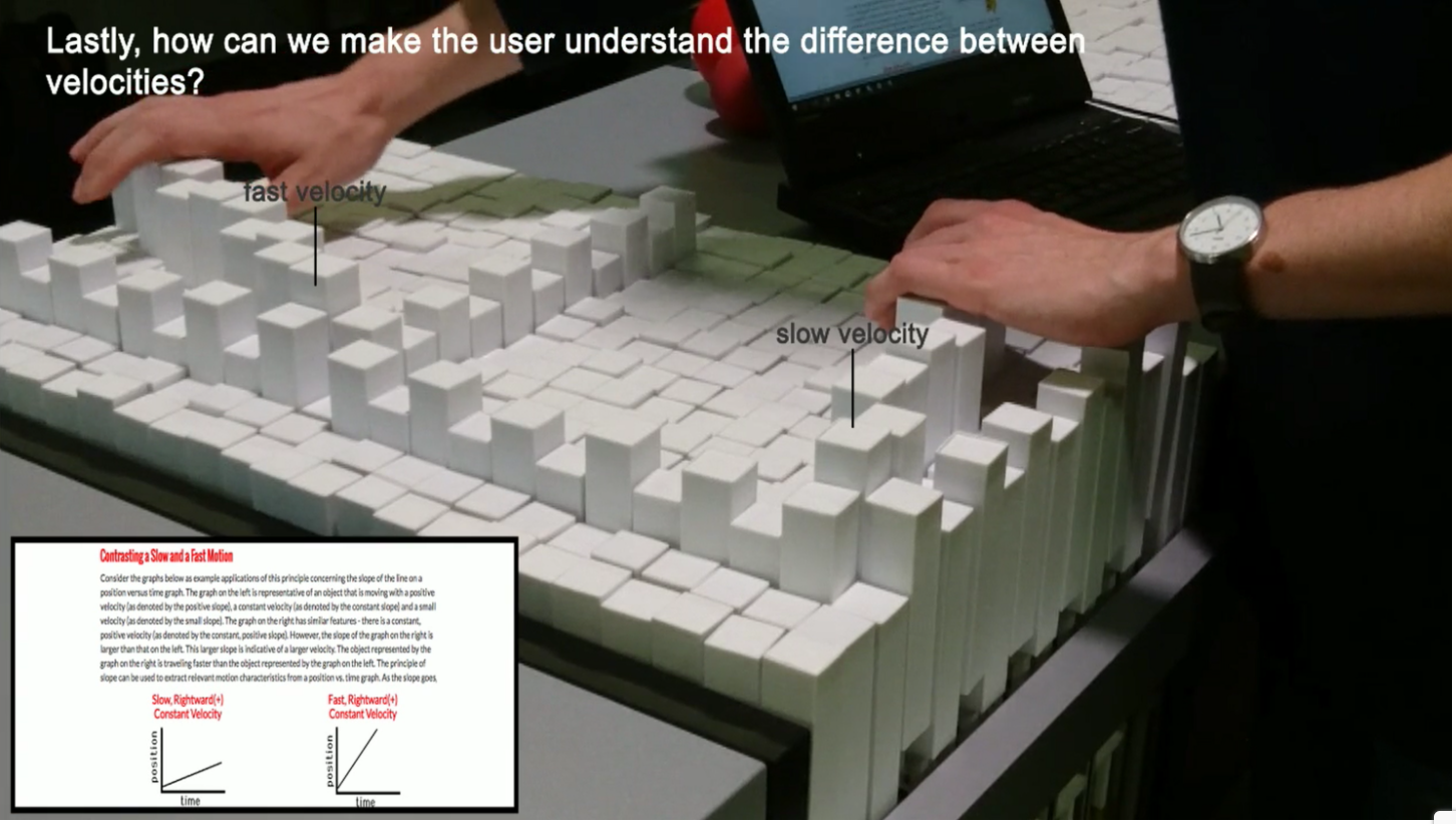
- Coupling motion and graph works well: According to the user the concept of coupling a straight motion (constant/accelerating velocity) with a 2D plot on a p-t-graph simultaneously provided a good understanding of the concept.
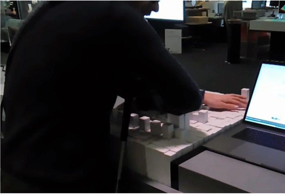
- Interaction with entire limbs: To fully comprehend the scenarios in which the graph dynamically evolved as an effect of a vehicle motion, the user positioned his entire forearm on the TraceForm to be able sense the datatrend as it was emerging. According to the user this technique worked very well but did require some awkward position and might constrain the type of graph displayed to a relatively straight-shape (given the nature of an arm…).
In general the feedback on TraceForm was very positive, and our test user expressed his sincere belief that if he had had such a system when he was learning about physics it would have saved him countless frustrating hours.
Final Concept / Video
The final concept can be seen below,
User Testing
We’ve combined important sections of our user testing in four brief videos:
Ideas on audio-clues and initial reaction
Suggestions for new features
Using the forearm to sense trends
General feedback